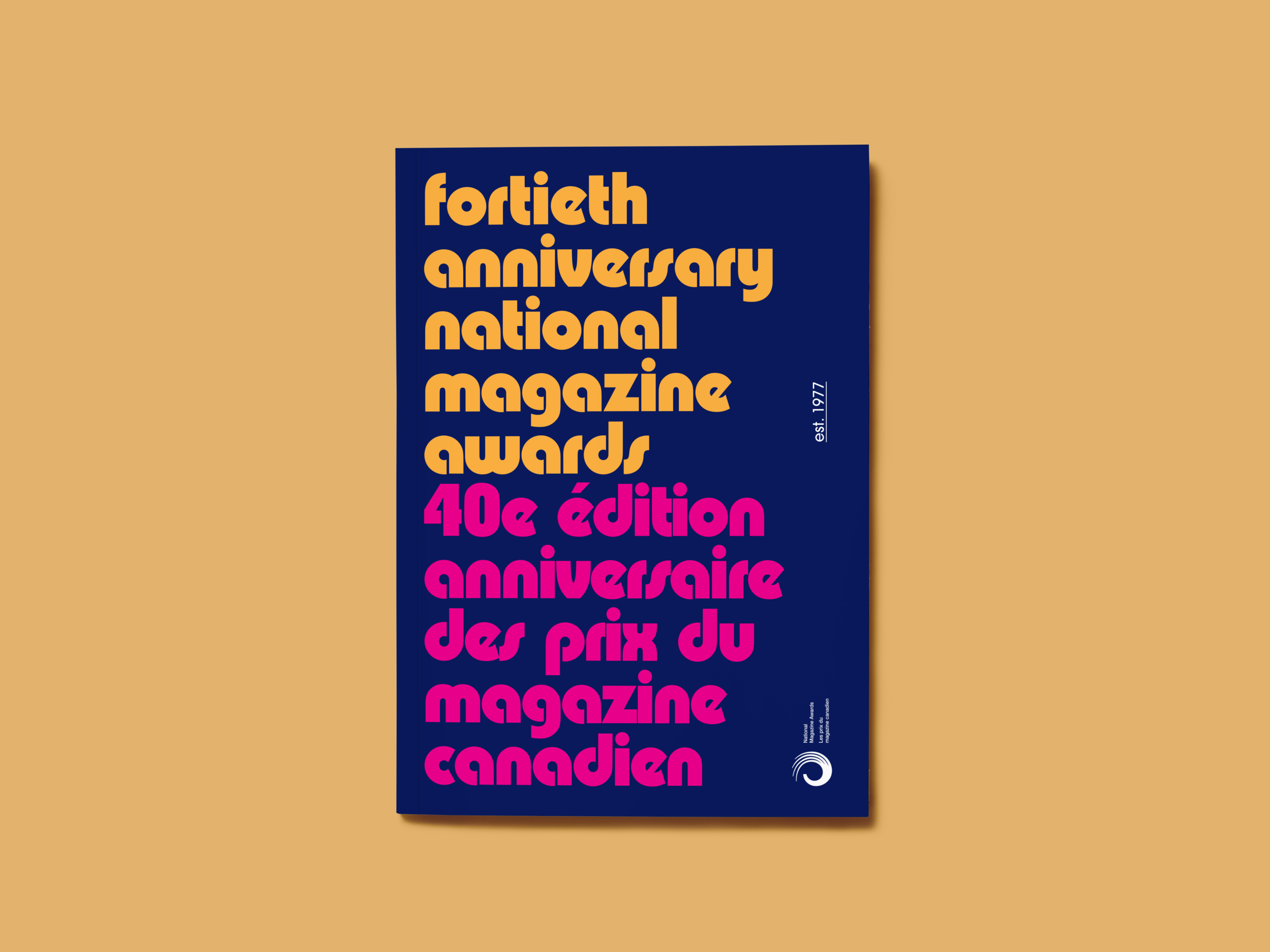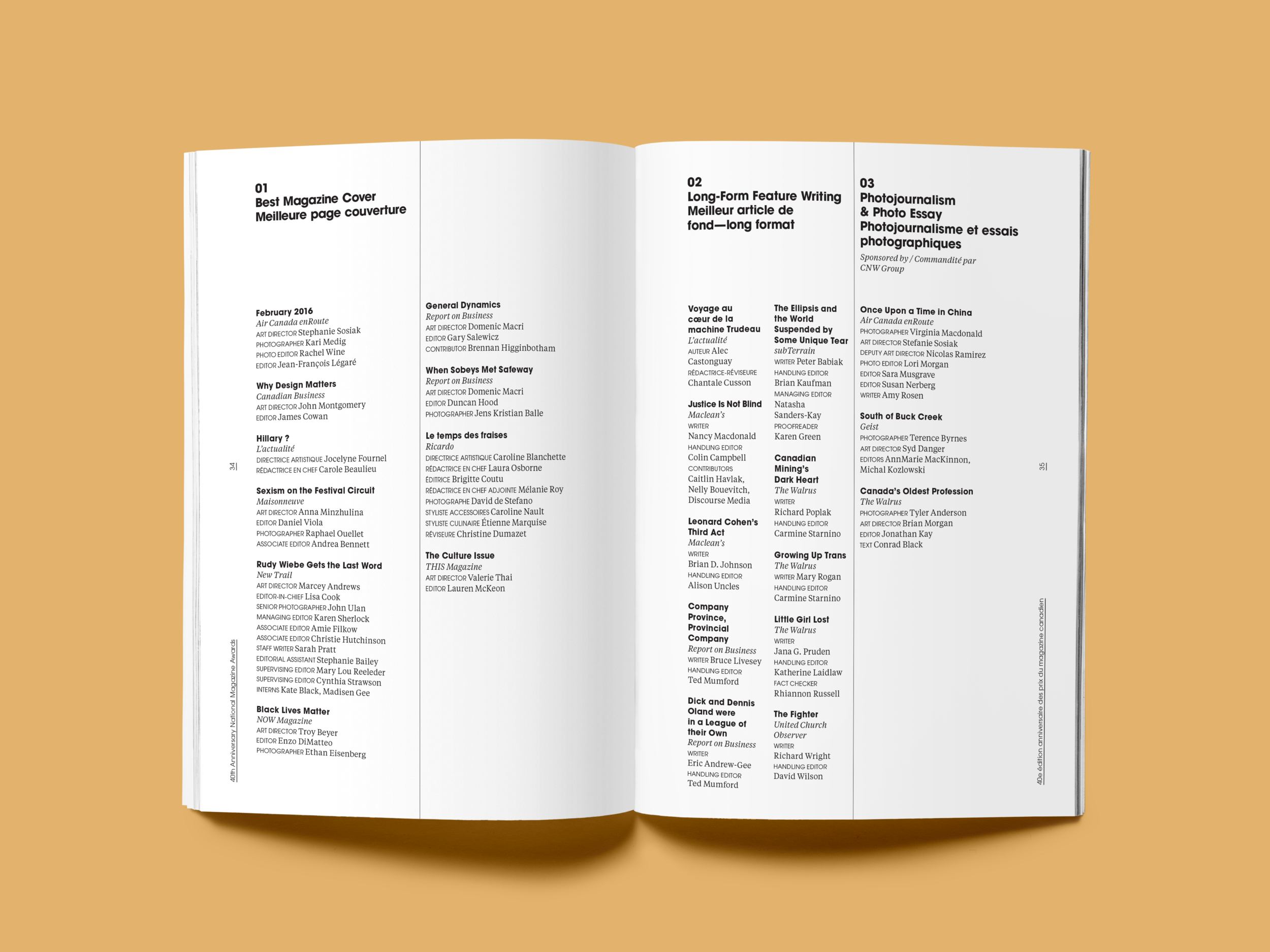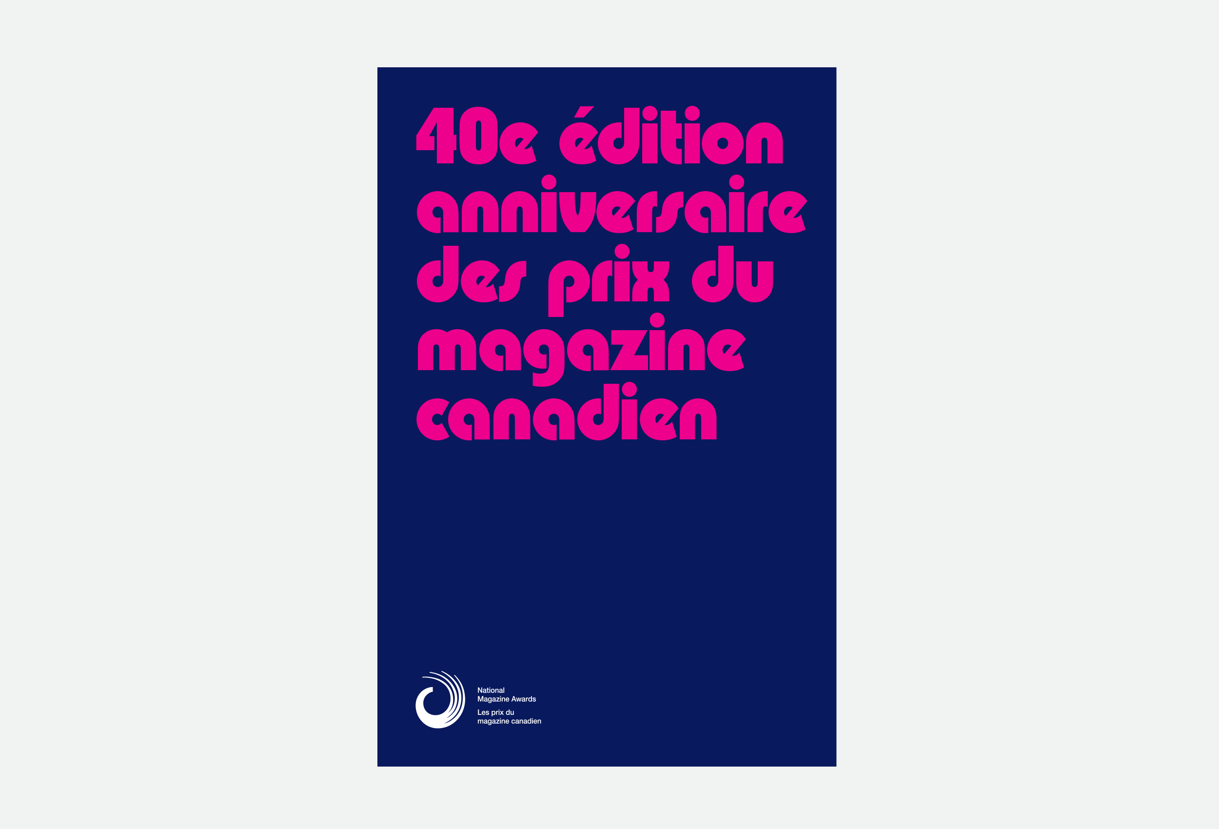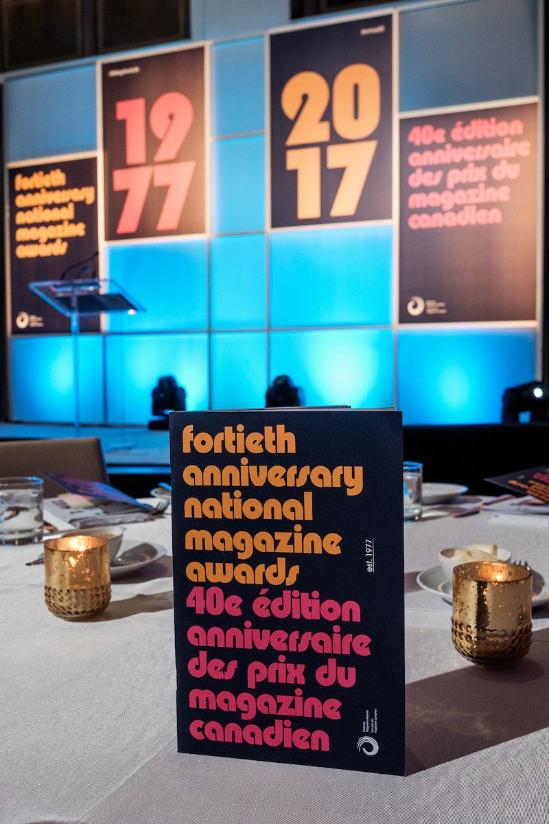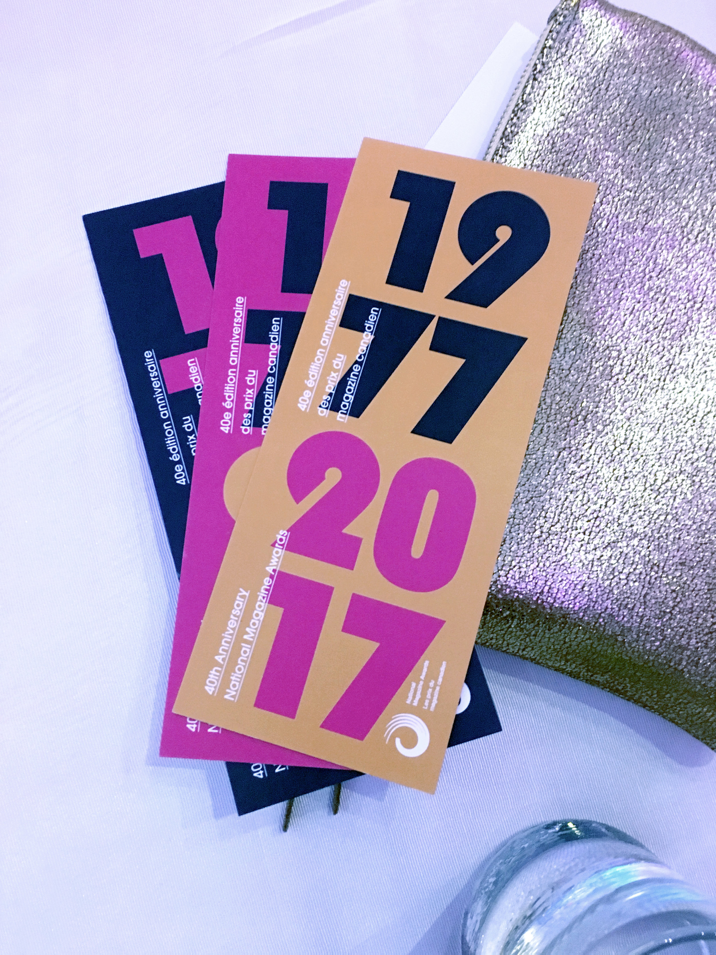
We have a long history with the National Magazine Awards—who promote editorial excellence in Canadian print and digital publications—so when they asked us to design their 40th anniversary collateral, we were thrilled!
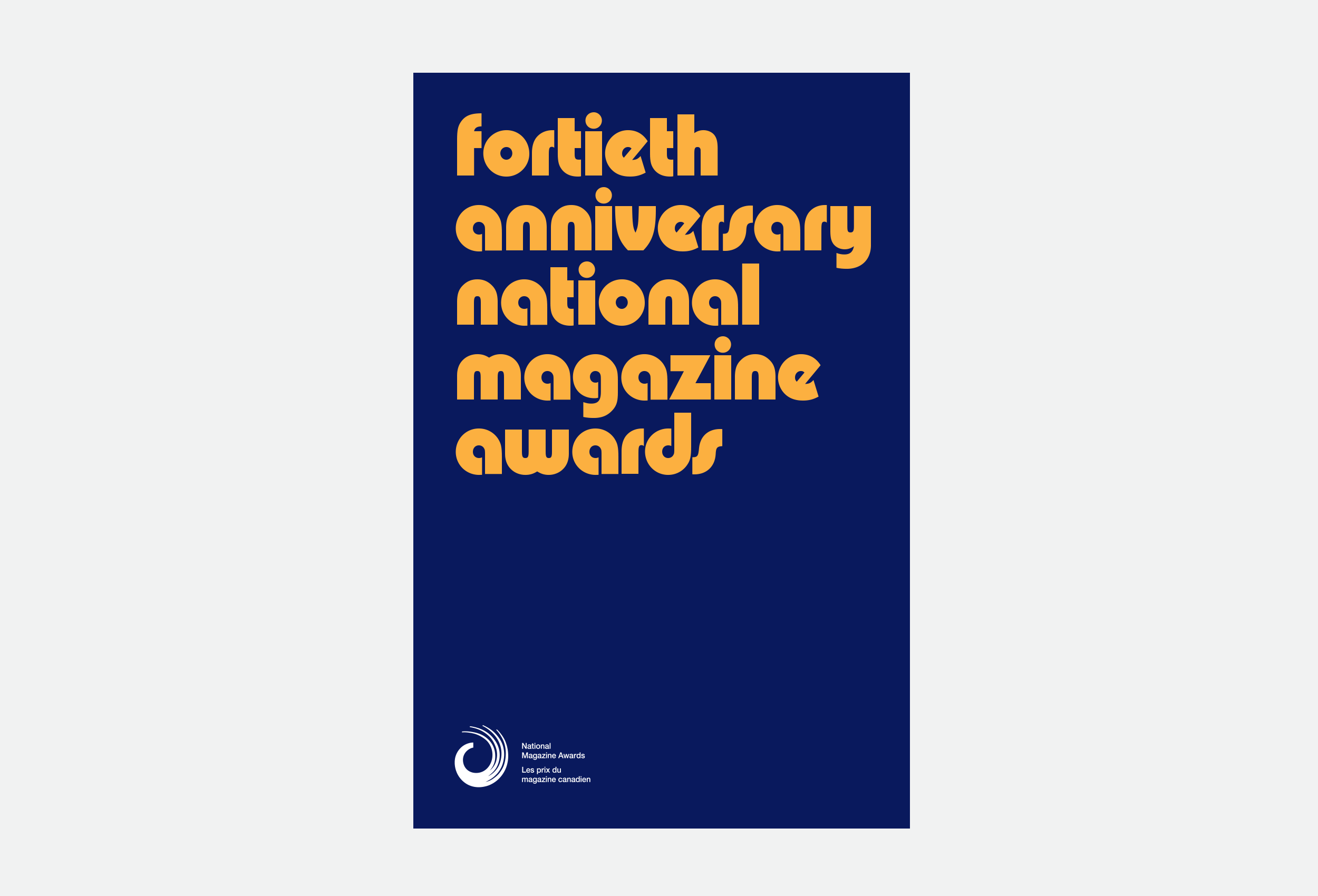
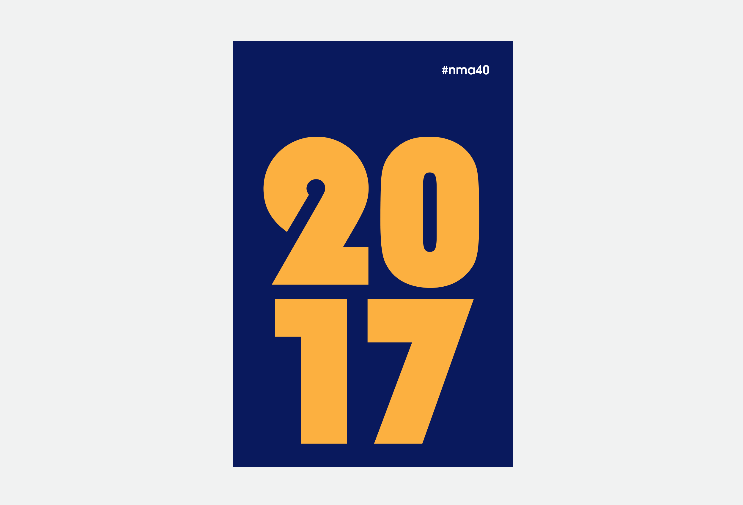
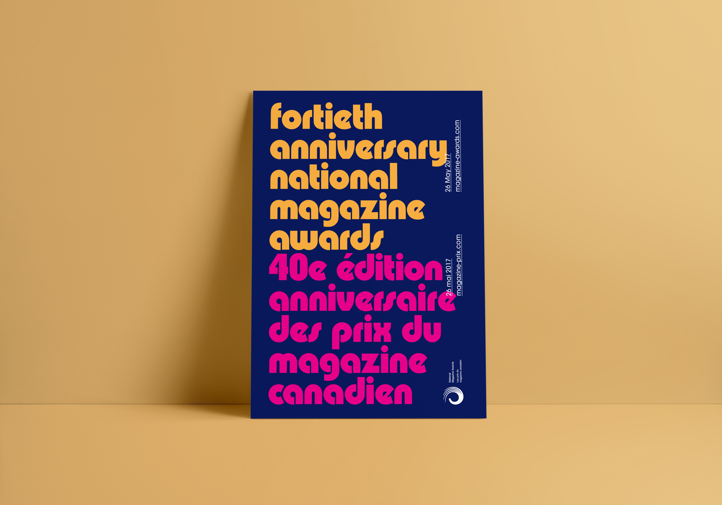
For the 2017 visual direction we went back through their archives and took design cues from the 1970s, the era the organization was established. Magazines in that era were so brightly coloured, so quirky, and just so much fun. During our research, we stumbled in Philip Kelly's font, Pump, which is said to have been drawn for Letraset during the 70s. It had all the vibes we were hoping for, so it become the cornerstone of our design.