Branding

Case Western Reserve University Magazine Rebrand

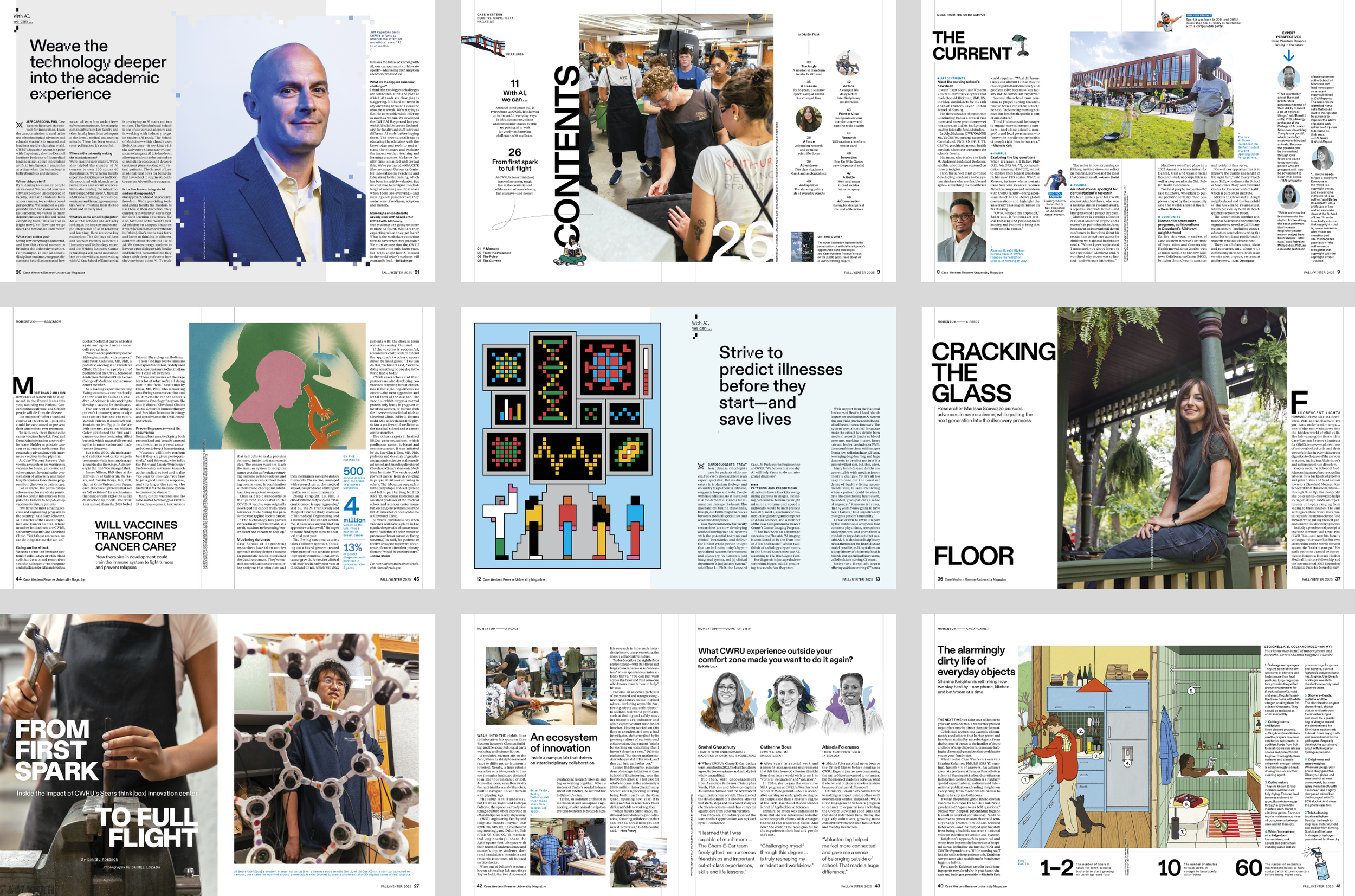
Case Western Reserve University is a private university based in Cleveland, Ohio, comprising eight schools with programs across fields including health sciences, engineering, law and the arts. They approached us to redesign their flagship print publication with both the functional goal of highlighting CWRU’s stories and the emotional goal of instilling pride, loyalty and engagement among alumni.

Guided by the university's core principle: “Be a Force,” we created a bold and thoughtful magazine that embodies the spirit of CWRU. It retains an element of history and prestige while looking forward and reflecting the university’s role as a catalyst for change and progress. The result is a fresh, contemporary design that blends intellect and energy—a beautiful, high-quality, tactile experience that readers look forward to taking in cover-to-cover.
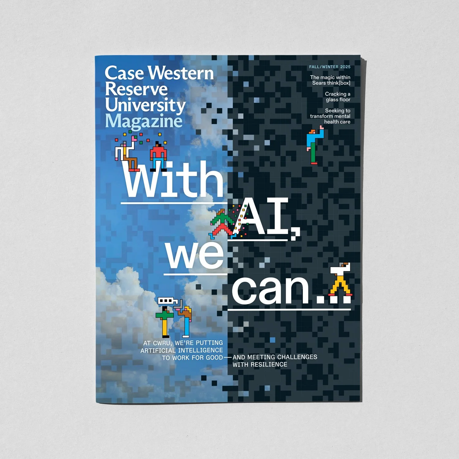
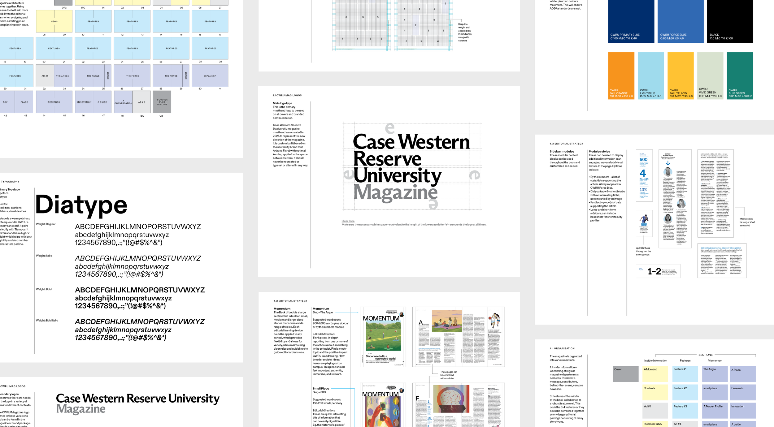
The new design pairs a friendly yet confident sans-serif with an accessible serif. It balances bold gestures with quiet moments on a structured, intersecting grid. The use of rules and interlocking columns emphasizes the juxtapositions that define CWRU's interdisciplinary nature and a touch of whimsy—like fun facts and spot illustrations—nod to the curious, nerdy world of the university. The new masthead was created in 2025 to represent the new direction of the magazine. It is custom-built and take on a variety of forms for different contexts.

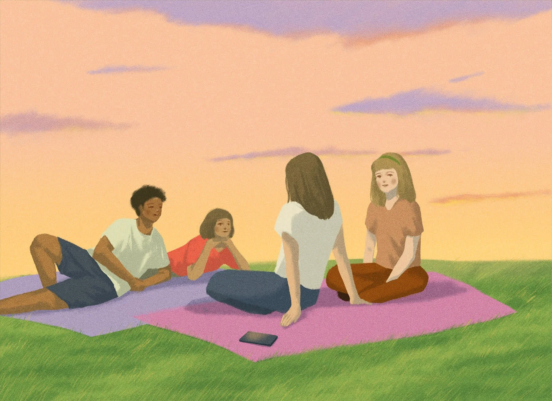
Beginning with the of-the-moment, faster cadence of the short front of book, transitioning into the denser, immersive feature well, and concluding with a large back of book featuring a variety of stories, each issue takes readers on a journey of present-day CWRU. Throughout the book, short stats, fast facts and infographics add texture, context and levity where needed.
"From start to finish Studio Wyse led us through a smart, strategic process, delivering a fresh, inventive, high-quality publication that makes us proud. The Wyse team are creative, talented, detail-oriented, patient, responsive and responsible. They combine a terrific artistic sensibility with a thoughtful, well-honed editorial understanding that improves the overall quality of the storytelling. They also bring wonderful illustrators and photographers to the project, sweat the details, are always ready with numerous inspired ideas and make the process fun. Working with them is a joy.”

–sandy livingston | executive editor | university marketing and communications
executive editor: sandy livingston

contributors: Maaike Canne, Billy Delfs, Oriana Fenwick, Anje Jager, Grace Kim, Mathieu Labrecque, Daniel Lozada, Da’Shaunae Marisa, Mark Oprea, Rinee Shah, Vartika Sharma, Michael Starghill, Leah Trznadel, McKinley Wiley

Life/Style

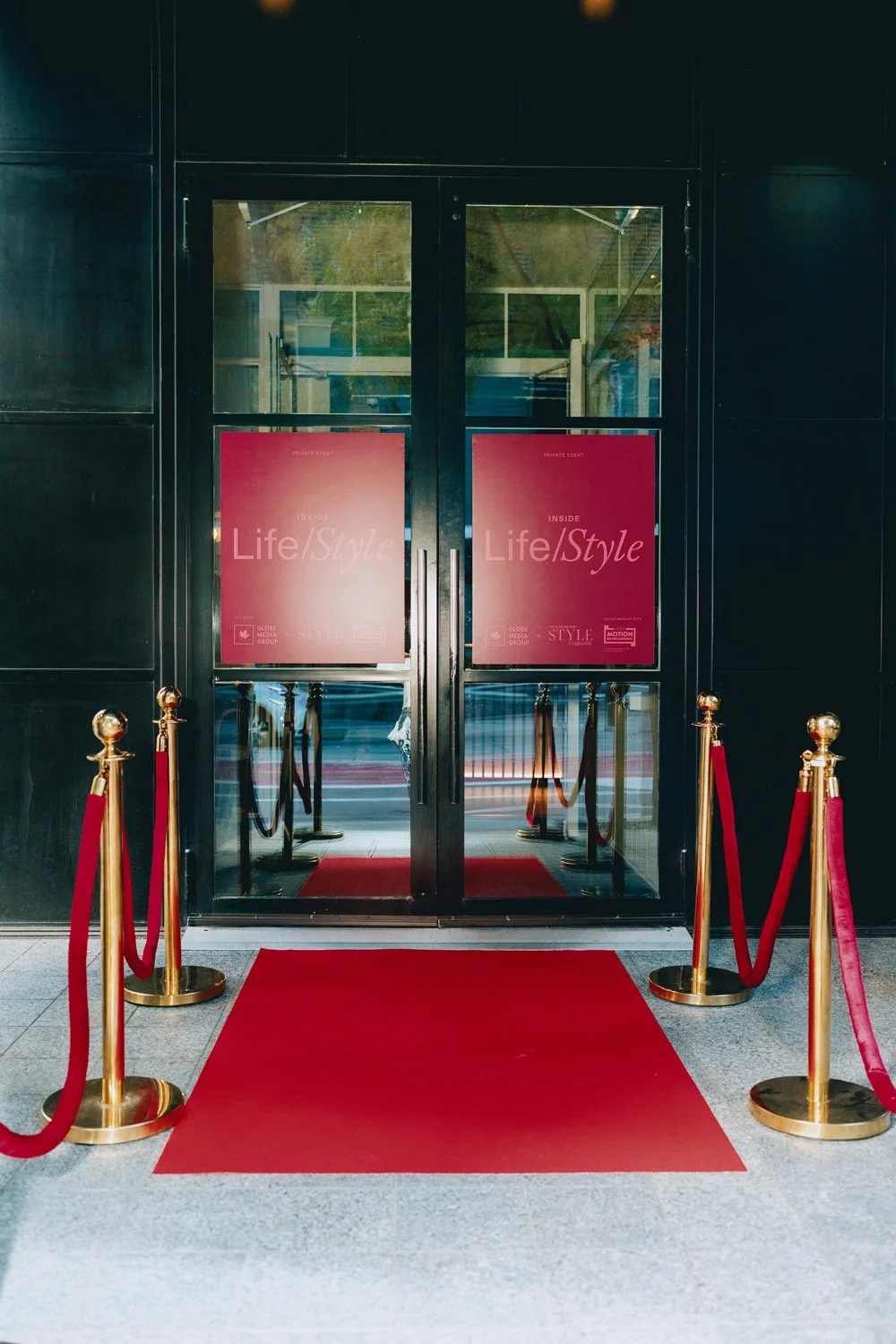
To coincide with the redesign of its Style Magazine, The Globe and Mail asked us to help them build awareness around its repositioned “Life” and “Style” verticals.

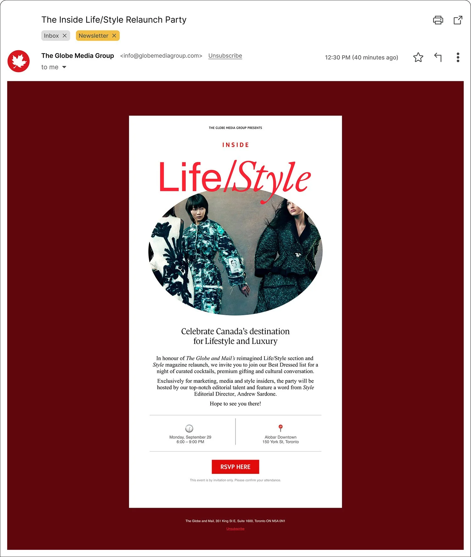
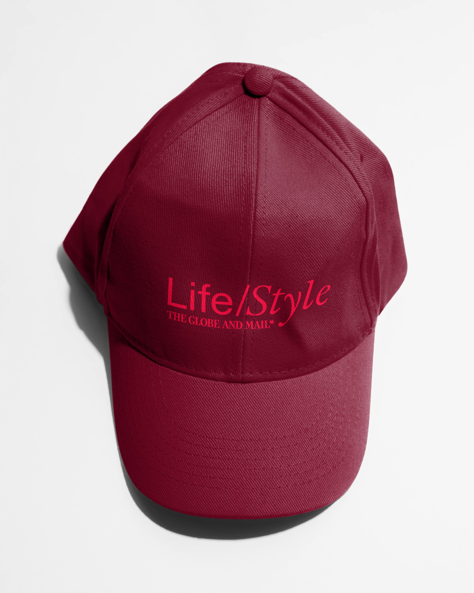
We developed a custom Life/Style wordmark that contrasts a utilitarian sans-serif with a classic fashion-forward serif typeface. 

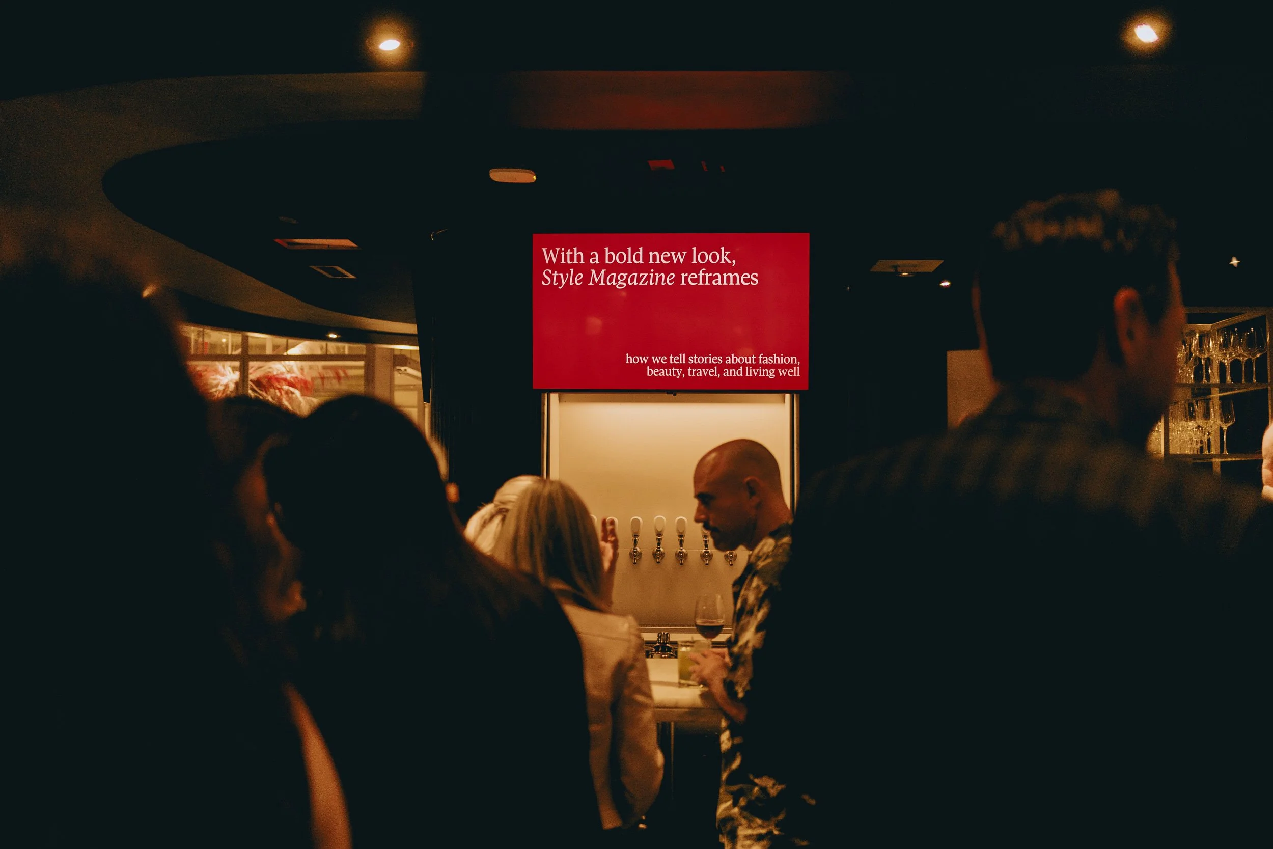
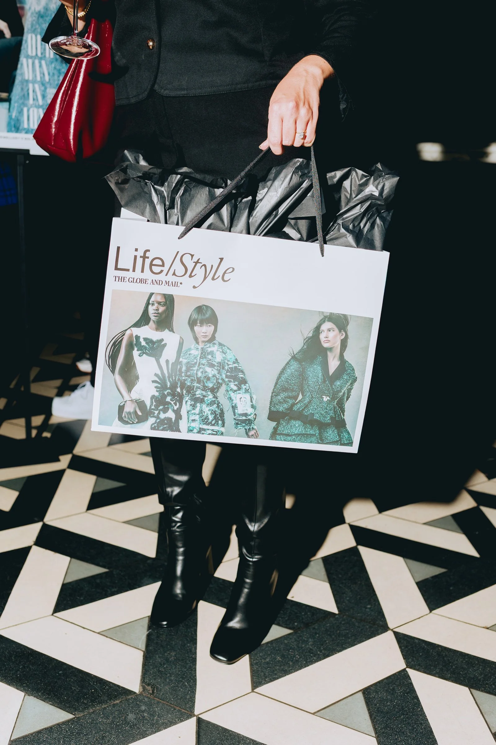
The relaunch was celebrated at the Inside Life/Style Launch Party event that brought together editorial leaders, cultural tastemakers, and brand partners.


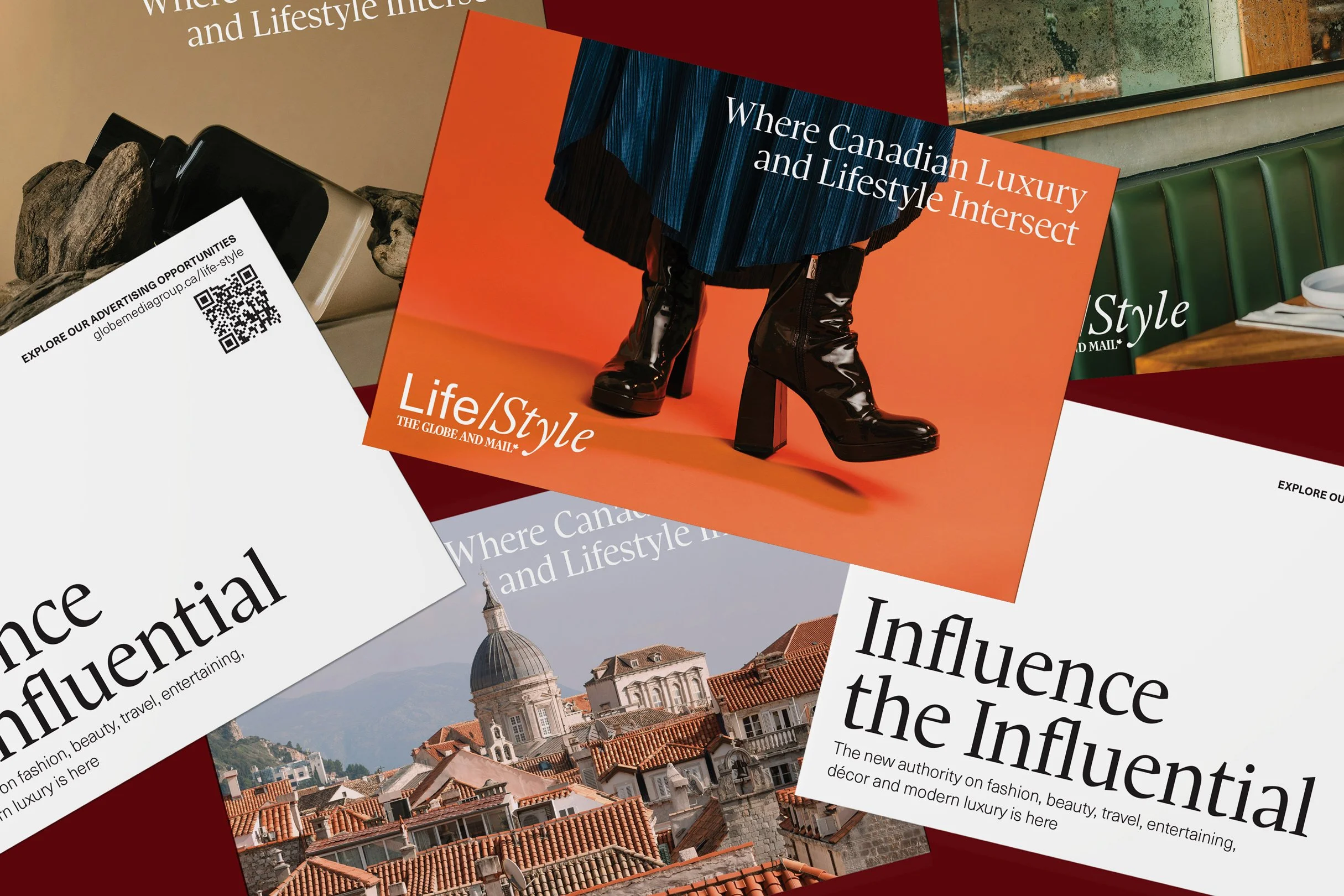
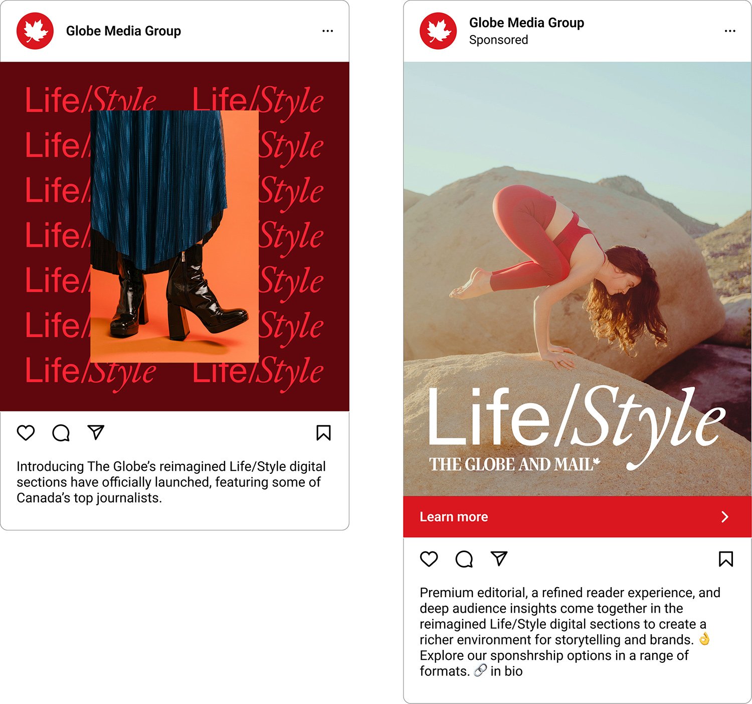
With the new Life/Style wordmark in place, we sourced key imagery to support the brand, then worked with The Globe and Mail marketing team to create a series of sponsored social media ads, banner ads, and other promotional items. The immediate goal was to build awareness about the Life/Style offerings and its value to advertisers in the Canadian marketplace. 


event photos: Albert Hoang

The Globe and Mail x Cannes Lions

The Globe and Mail has been the official Canadian representative for the Cannes Lions Festival of Creativity for the last twenty years. 

They asked us to develop a fresh, cohesive identity that speaks to the Canadian focus while bringing in French Riviera vibes—even providing playlists in their brief for inspo! 

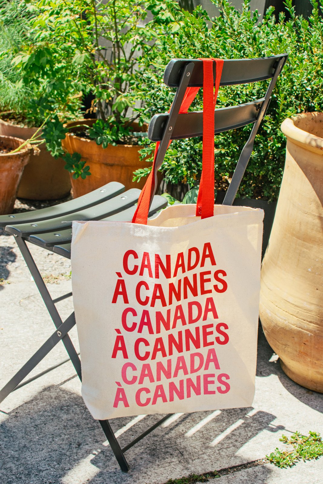
We dusted off our high school French to come up with a framing device for the system, using the language to demarcate their series of events: Pré Cannes, Canada À Cannes, Après Cannes—and adding a series of phrases for a fun, friendly touch throughout. 

Visually, we landed on the idea of ‘Postcards from Cannes’—leaning into an elegant typeface with Art Nouveau proportions paired with sunny riviera-inspired photography.

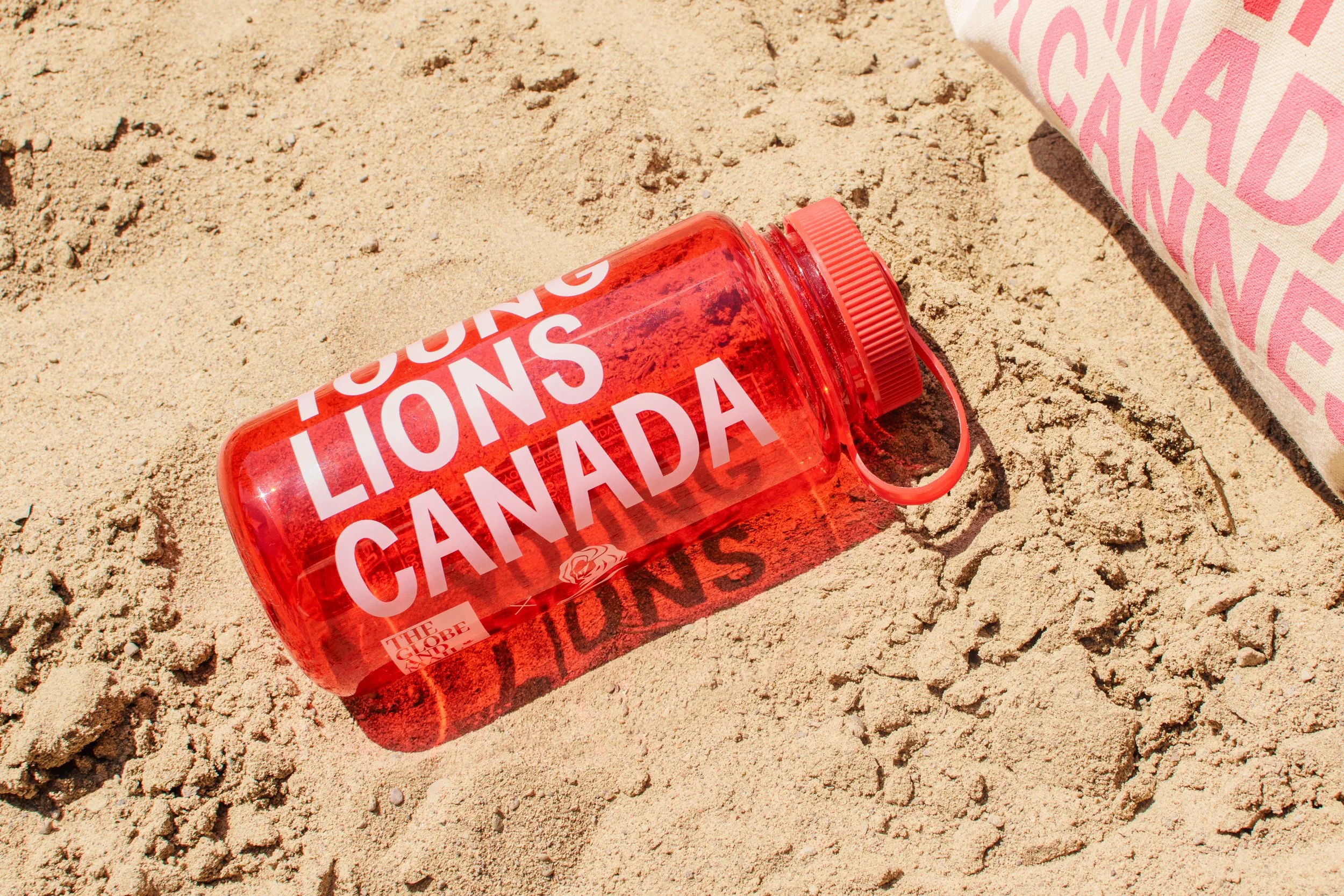
The result is a bold scalable system that can be applied effectively to a wide range of extensions, including e-vites, posters, ads, signage, social media, merch and more. 

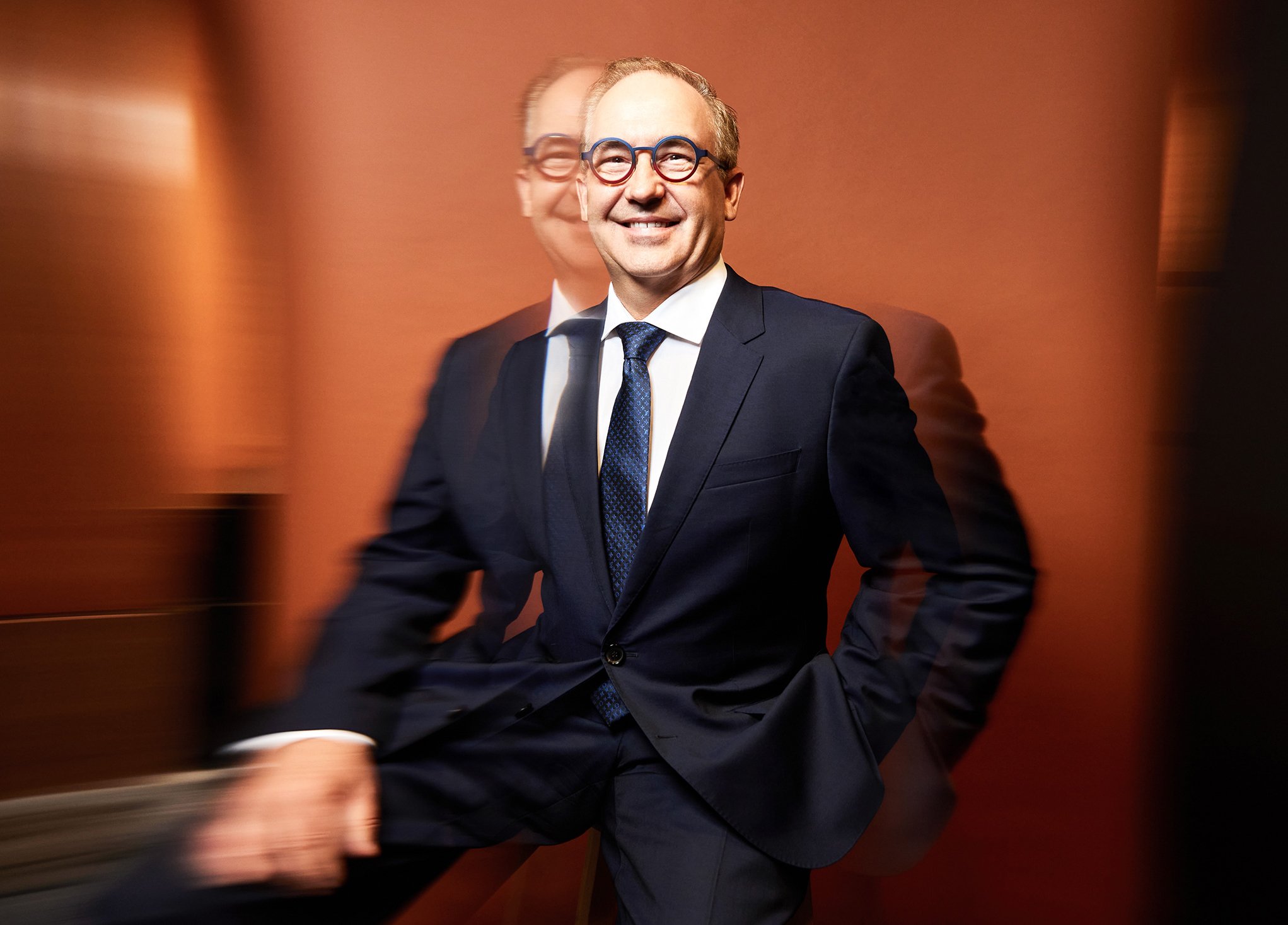
“It was a milestone year for The Globe as we celebrated 20 years as Canada’s official representative to the Cannes Lions International Festival of Creativity. I couldn’t have asked for a better creative partner than Studio Wyse to help reimagine and elevate our visual identity.
From event branding systems and comms templates to custom merch (those matchbooks! that broadsheet paper!), their work helped The Globe show up with clarity, cohesion, and undeniable style.”
— Marcin Zerek, Head of Trade Marketing at The Globe and Mail

For the cover of the custom 8-page newspaper, illustrator Giacomo Gambineri built a world around the theme of Canada in Cannes – including numerous Canadiana references (see if you can find the trash panda) and other nods to the festival. Plus, some spots for a witty weather forecast!

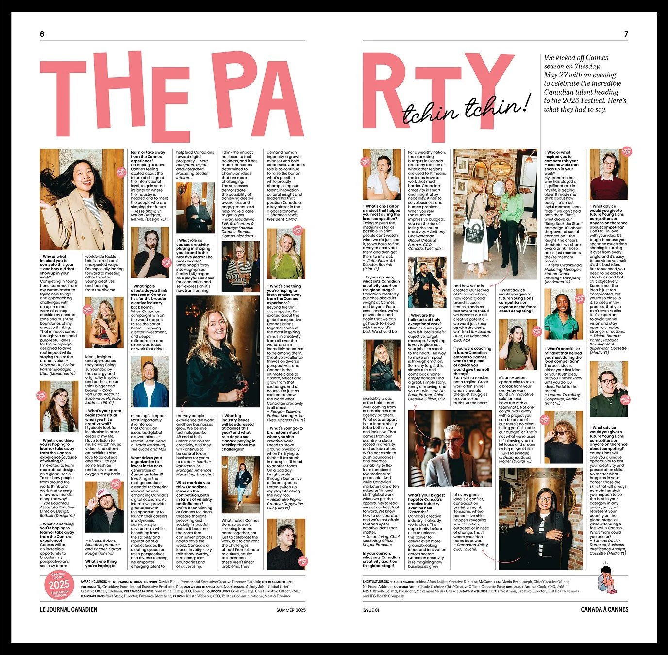
Inside, the paper features advice from award-winning creatives, past Grand Prix & Titanium award-winning work, and Q&As with Canadian talent heading to this year’s festival paired with photos from the Pré Cannes event by Albert Hoang.

EXECUTIVE EDITOR: Marcin ZereK; EDITOR AND WRITER: CHARLOTTE HERROLD

contributors: Giacomo gambineri, Albert Hoang

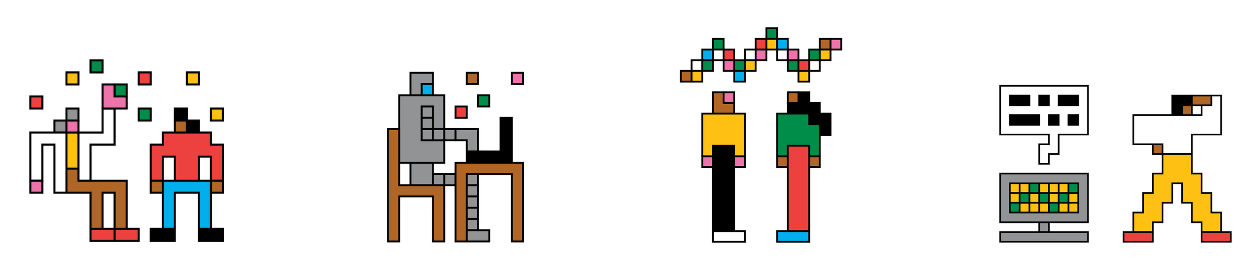
Lately

Meet Lately, the latest tech & business podcast from The Globe and Mail. The weekly 30-minute episodes tackle big heady topics like: the fake online review economy, technofeudalism, posting your layoff on TikTok, and more.

We established a modern and buzzy identity, pairing an open geometric sans-forward workmark with a reduced, pop-art colour palette and brought in Rose Wong to help us develop a custom illustration for the podcast cover.

“Studio Wyse’s designs break through the clutter of the media landscape. The team’s branding for The Globe’s Lately is punchy, bold and fun — it matches the voice of the show and pops on a user’s scroll of favourite podcasts.”
— Maryam Sanati Managing Director, Product Growth and Innovation, Globe Media Group

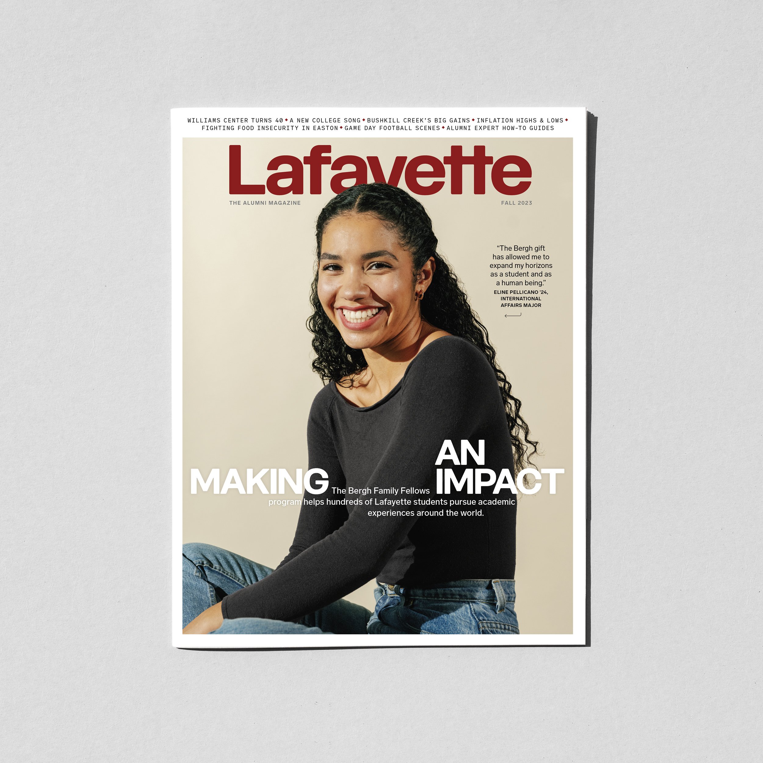
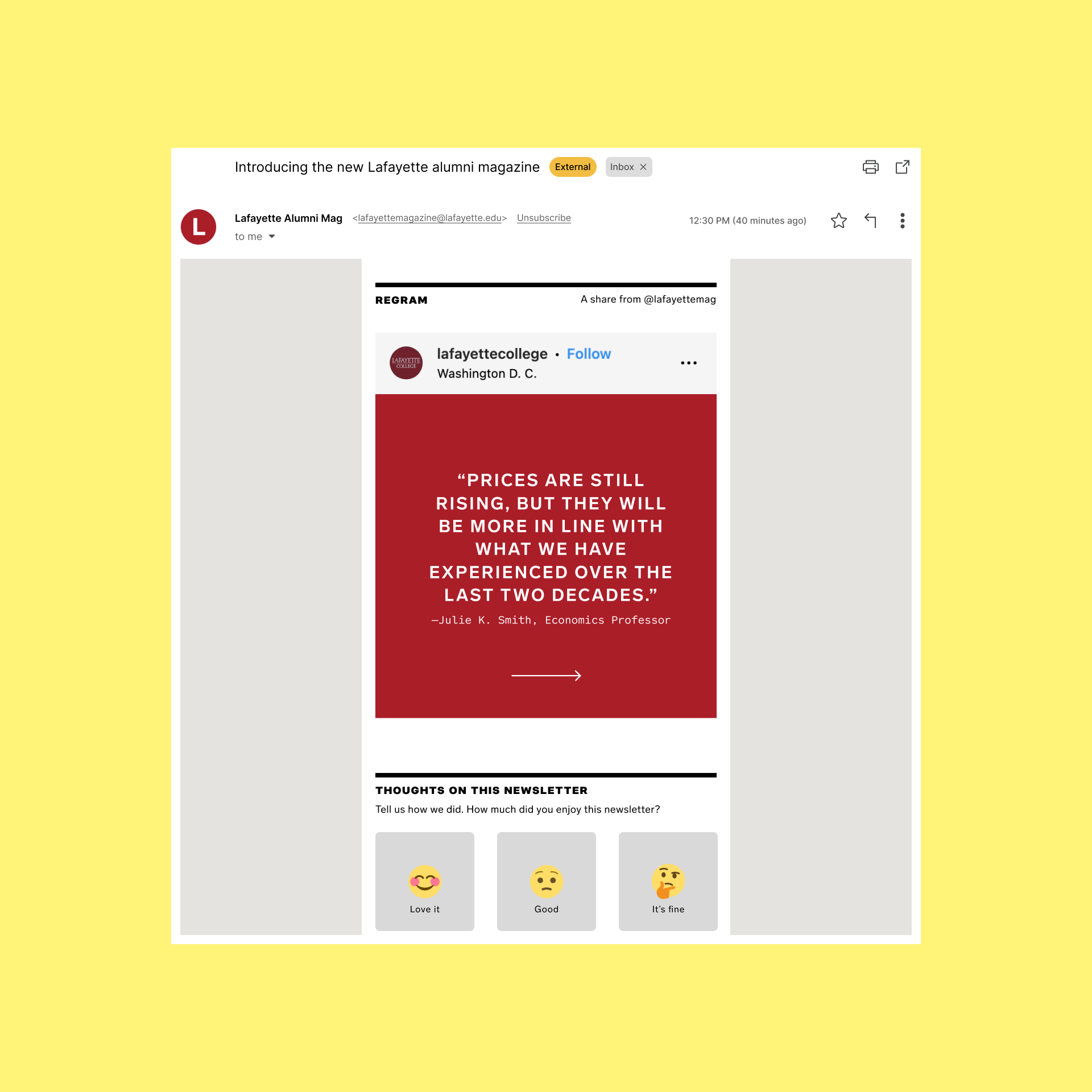
Lafayette Magazine Rebrand

Lafayette College is a small private liberal arts college in the U.S. Founded in 1826, they are proudly independent and academically competitive, offering bachelor degrees in dozens of arts and sciences fields including five in engineering. 

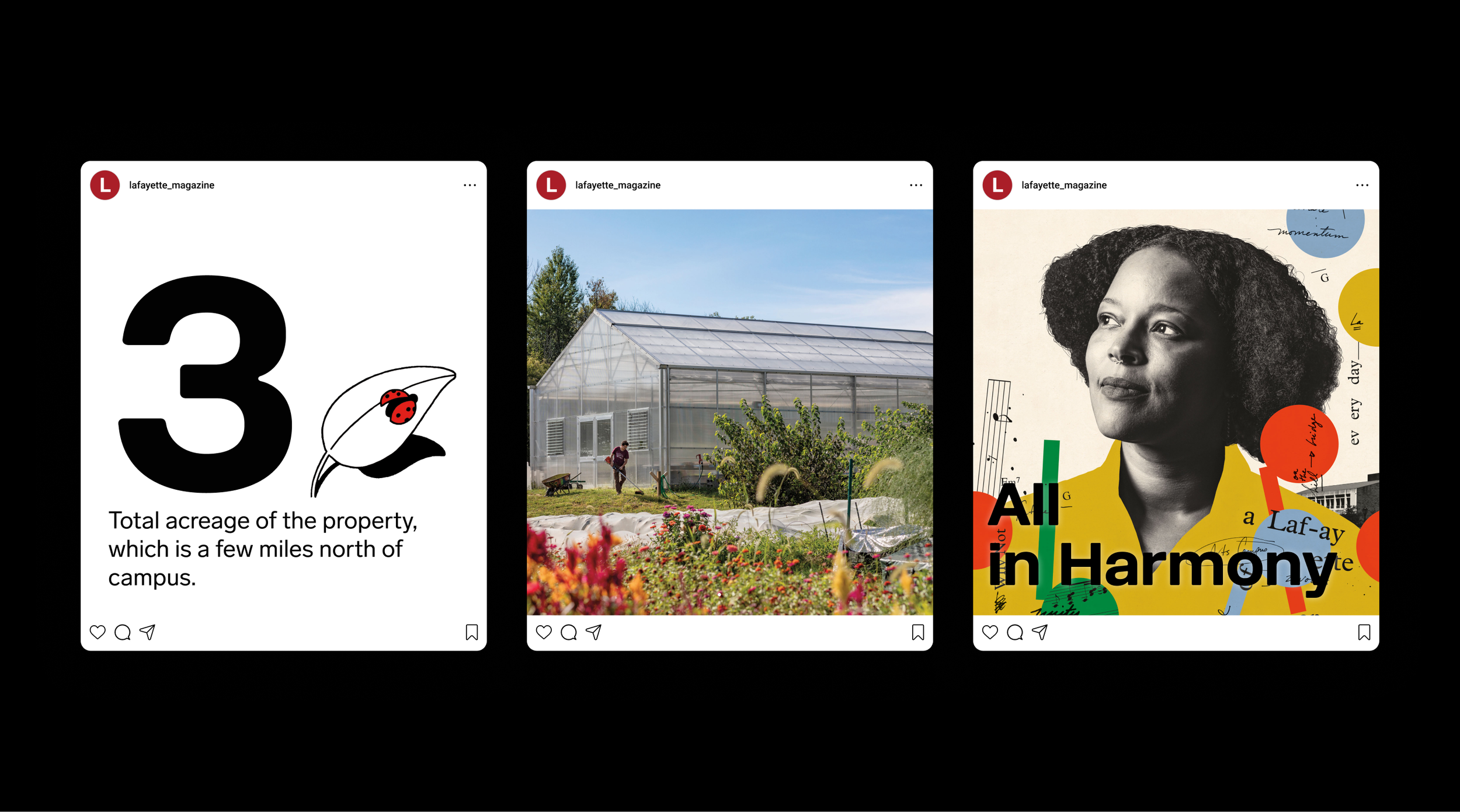
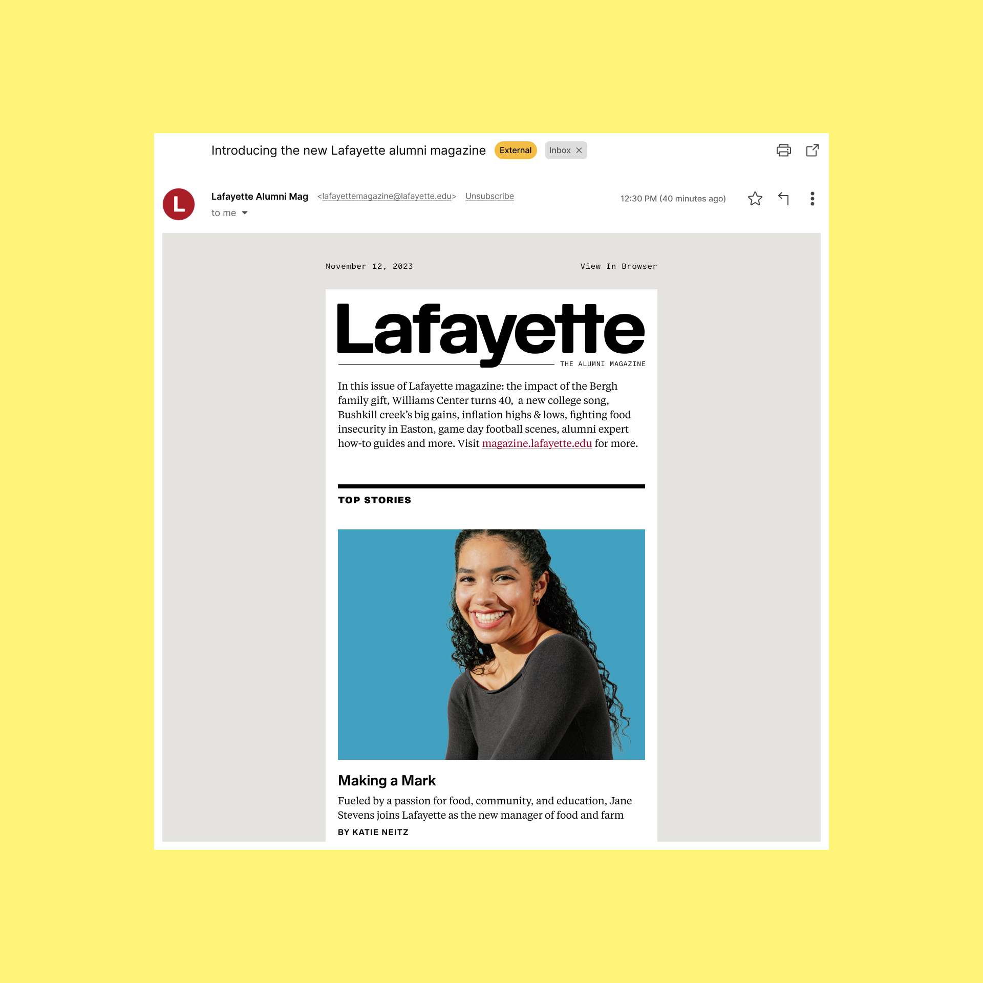
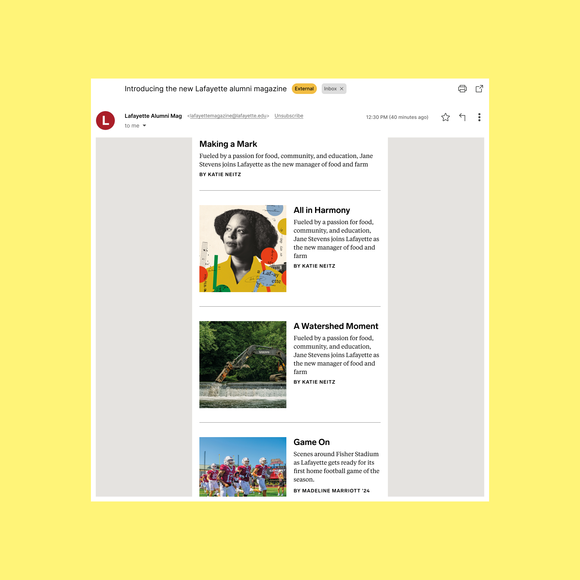
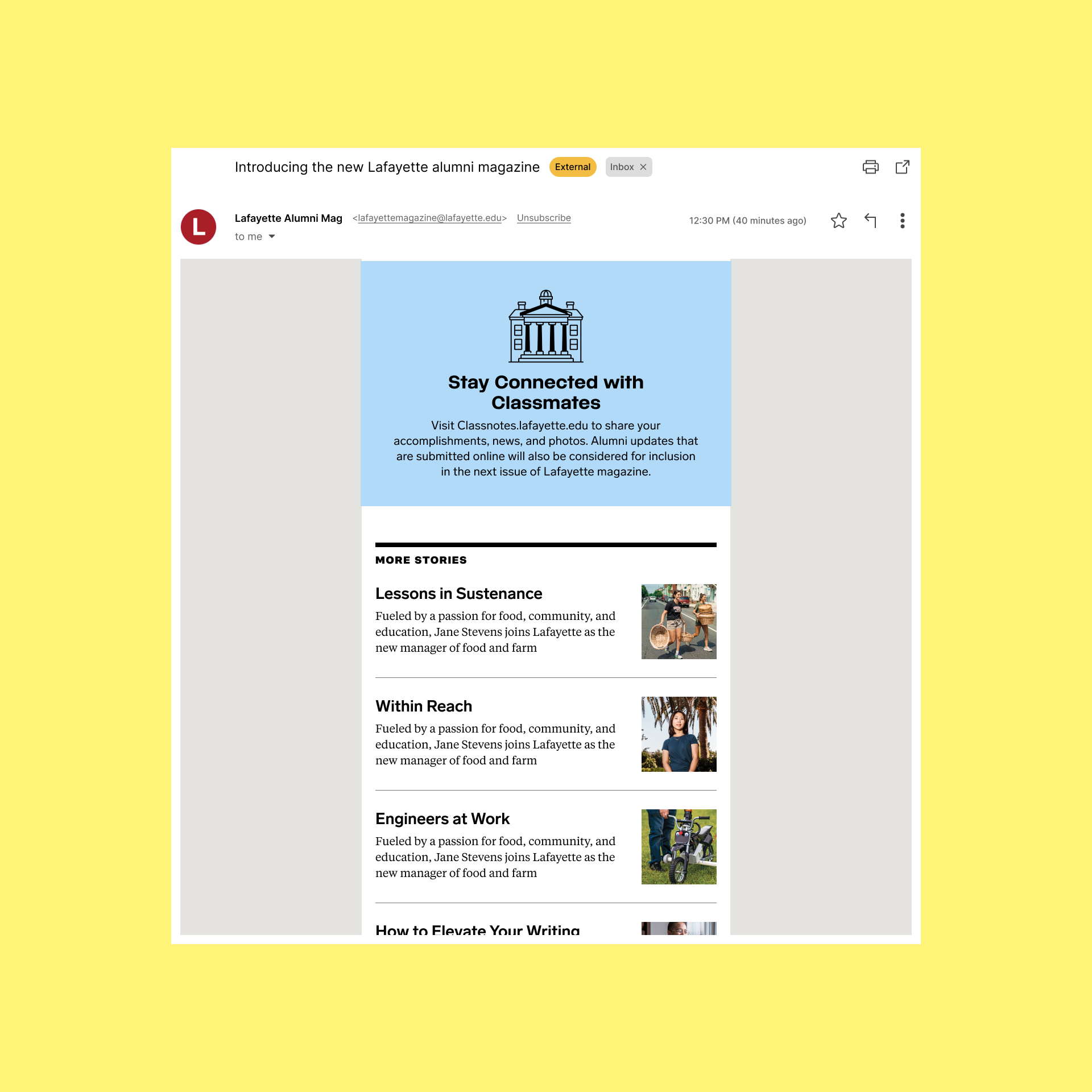
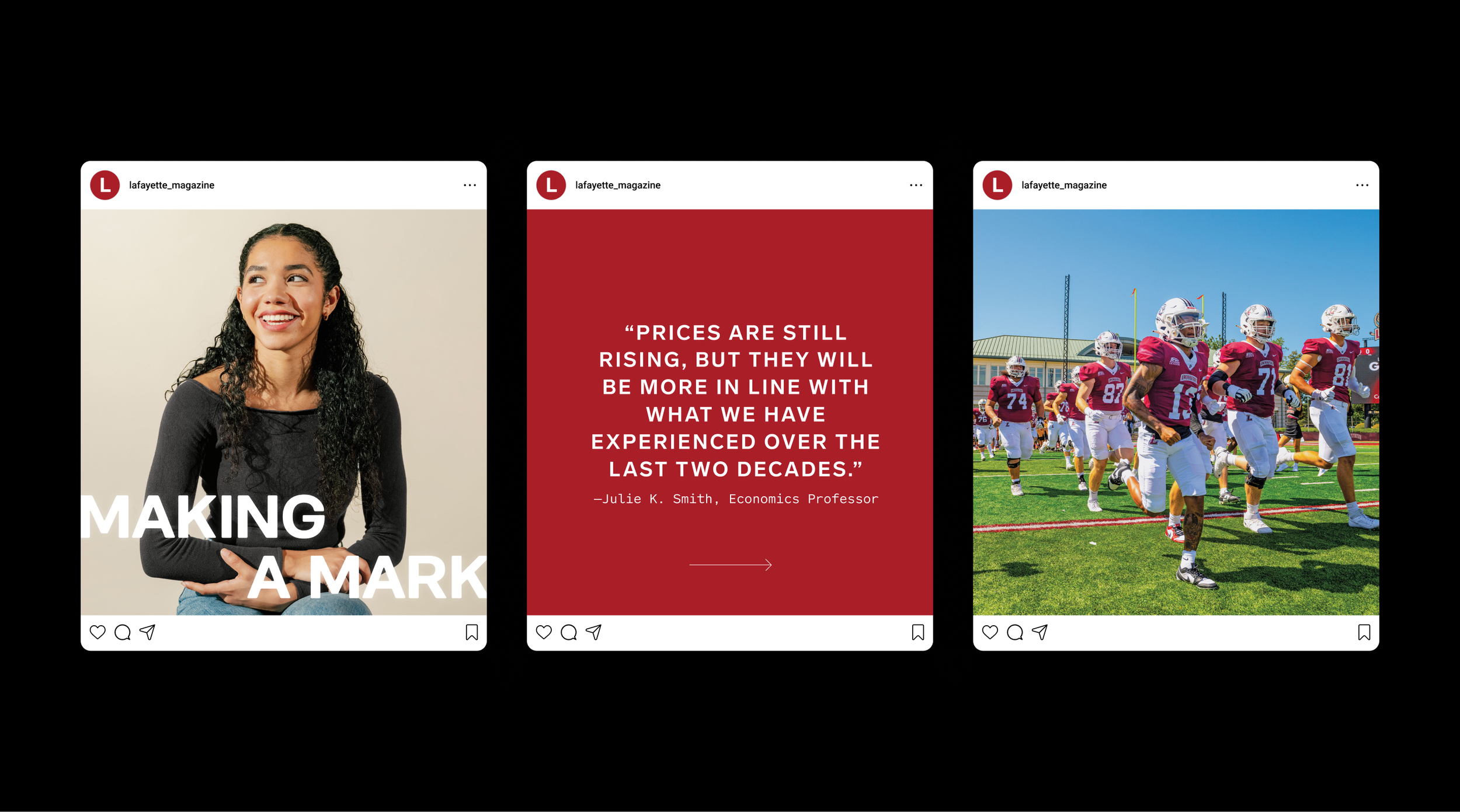
When they approached us, both internal sentiment and feedback from the college community was that Lafayette is among their peers in every measurement that matters—they just weren’t showing it effectively. We set-out to completely re-envision their flagship communication vehicle—the quarterly alumni magazine, its digital counterpart and the supporting newsletter and social media channels. 

The goal was to position the college as an innovative, nationwide leader by showing the impact of its alumni, faculty, and students. We worked with the team to establish a strong editorial mandate and strategy, with more visual content and variety in story formats and a sprinkling of small details, entry points and elements of surprise throughout. 

The new magazine and supporting website are relevant, innovative and confident, telling authentic and meaningful stories while bringing in an energetic and dynamic visual approach. It evokes pride in Lafayette and offers alumni a backstage pass not found elsewhere, all aligned with digital assets that amplify and extend the depth and creativity of the printed stories.