Redesign

Lafayette Magazine Rebrand

Lafayette College is a small private liberal arts college in the U.S. Founded in 1826, they are proudly independent and academically competitive, offering bachelor degrees in dozens of arts and sciences fields including five in engineering. 

When they approached us, both internal sentiment and feedback from the college community was that Lafayette is among their peers in every measurement that matters—they just weren’t showing it effectively. We set-out to completely re-envision their flagship communication vehicle—the quarterly alumni magazine, its digital counterpart and the supporting newsletter and social media channels. 

The goal was to position the college as an innovative, nationwide leader by showing the impact of its alumni, faculty, and students. We worked with the team to establish a strong editorial mandate and strategy, with more visual content and variety in story formats and a sprinkling of small details, entry points and elements of surprise throughout. 

The new magazine and supporting website are relevant, innovative and confident, telling authentic and meaningful stories while bringing in an energetic and dynamic visual approach. It evokes pride in Lafayette and offers alumni a backstage pass not found elsewhere, all aligned with digital assets that amplify and extend the depth and creativity of the printed stories.

Willamette University Magazine

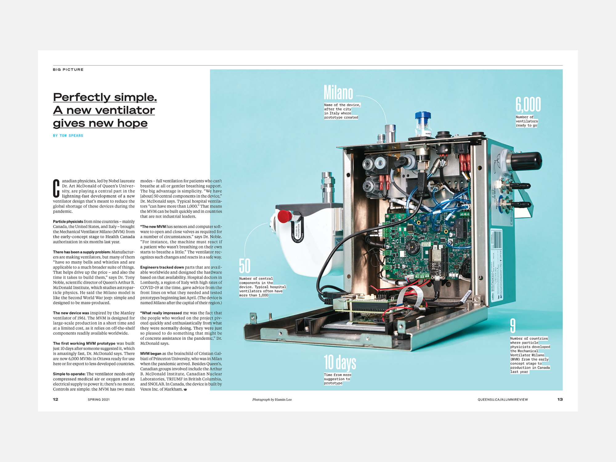
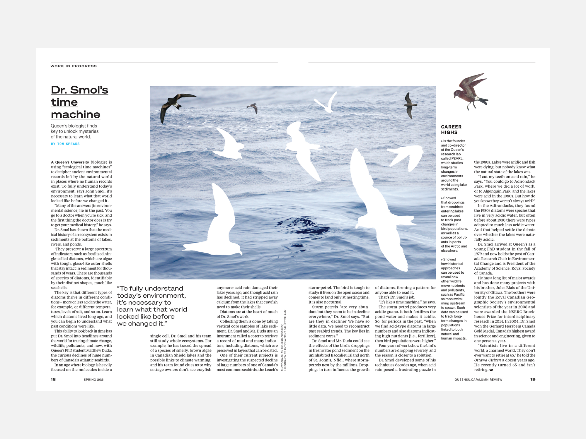
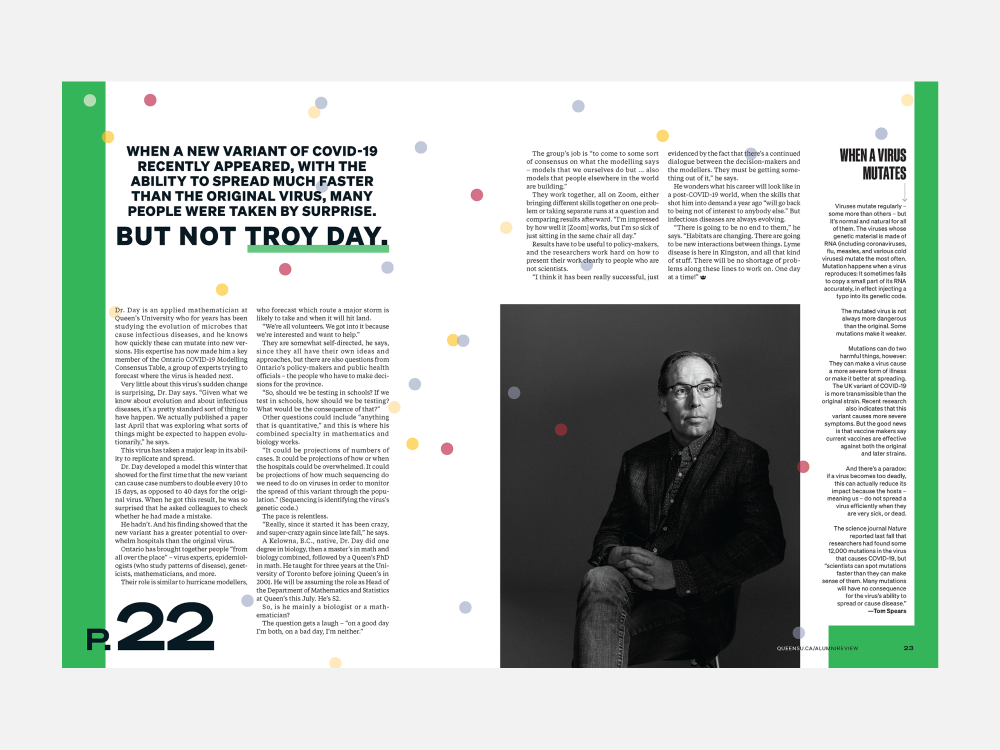
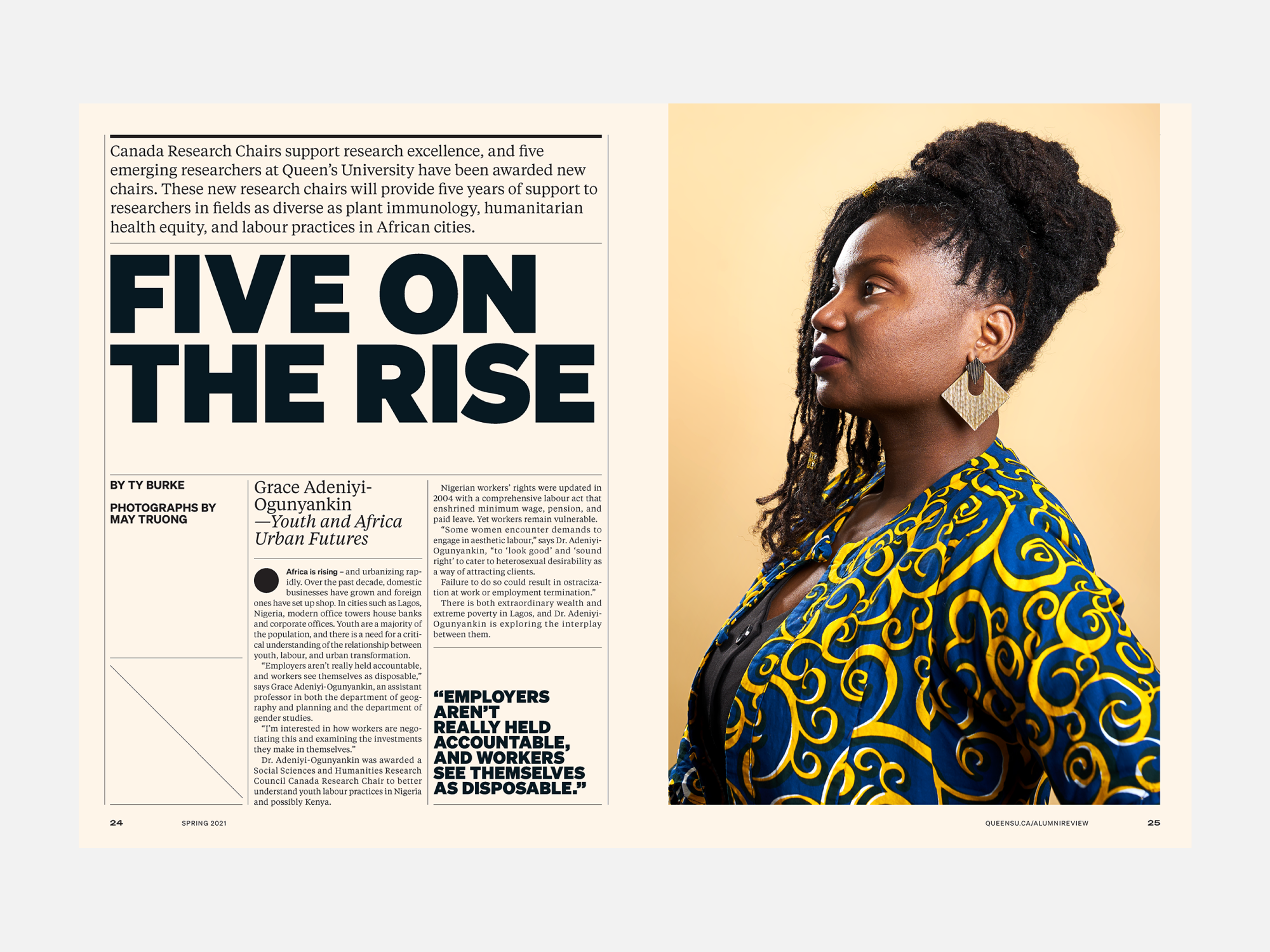
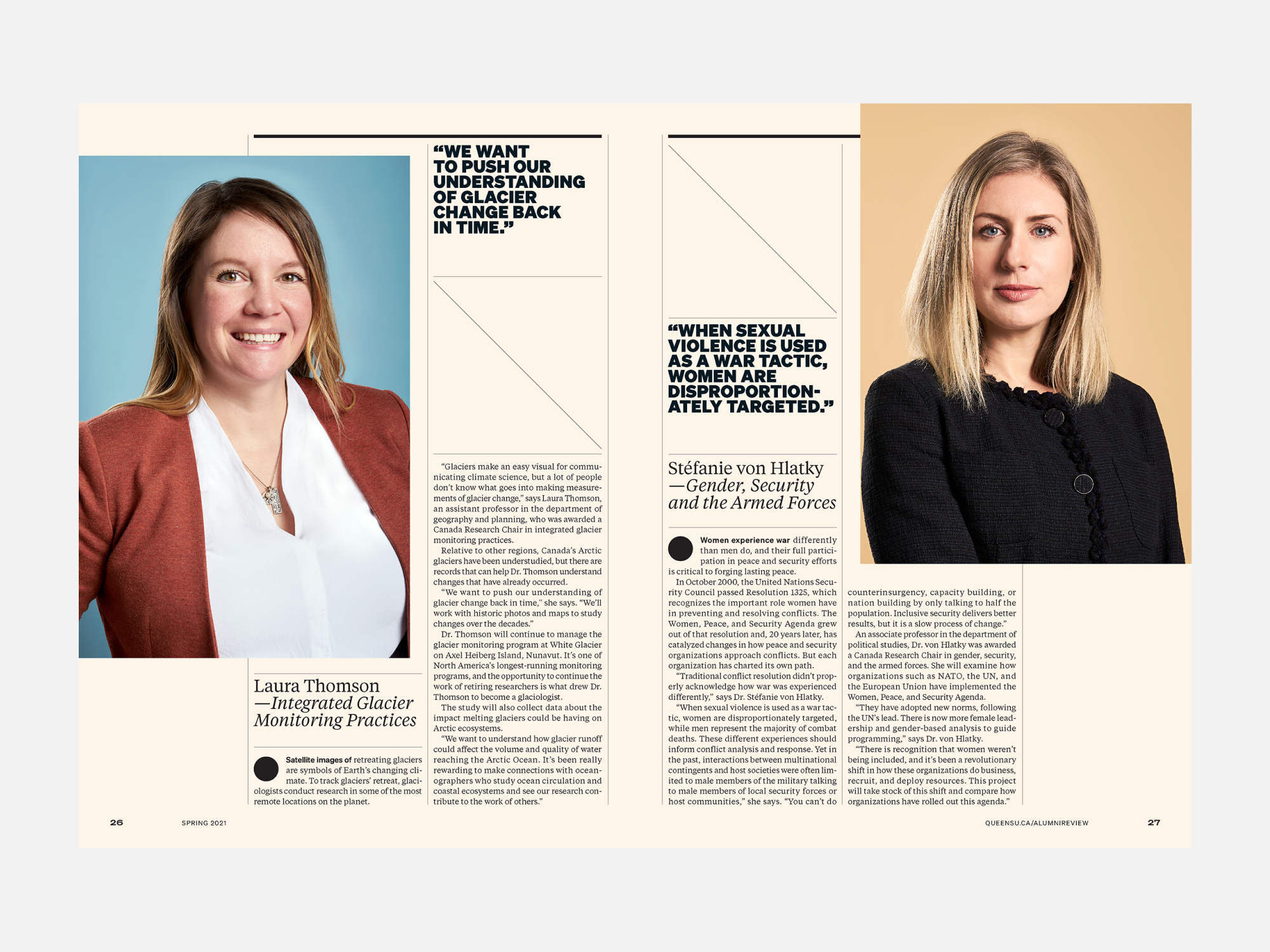
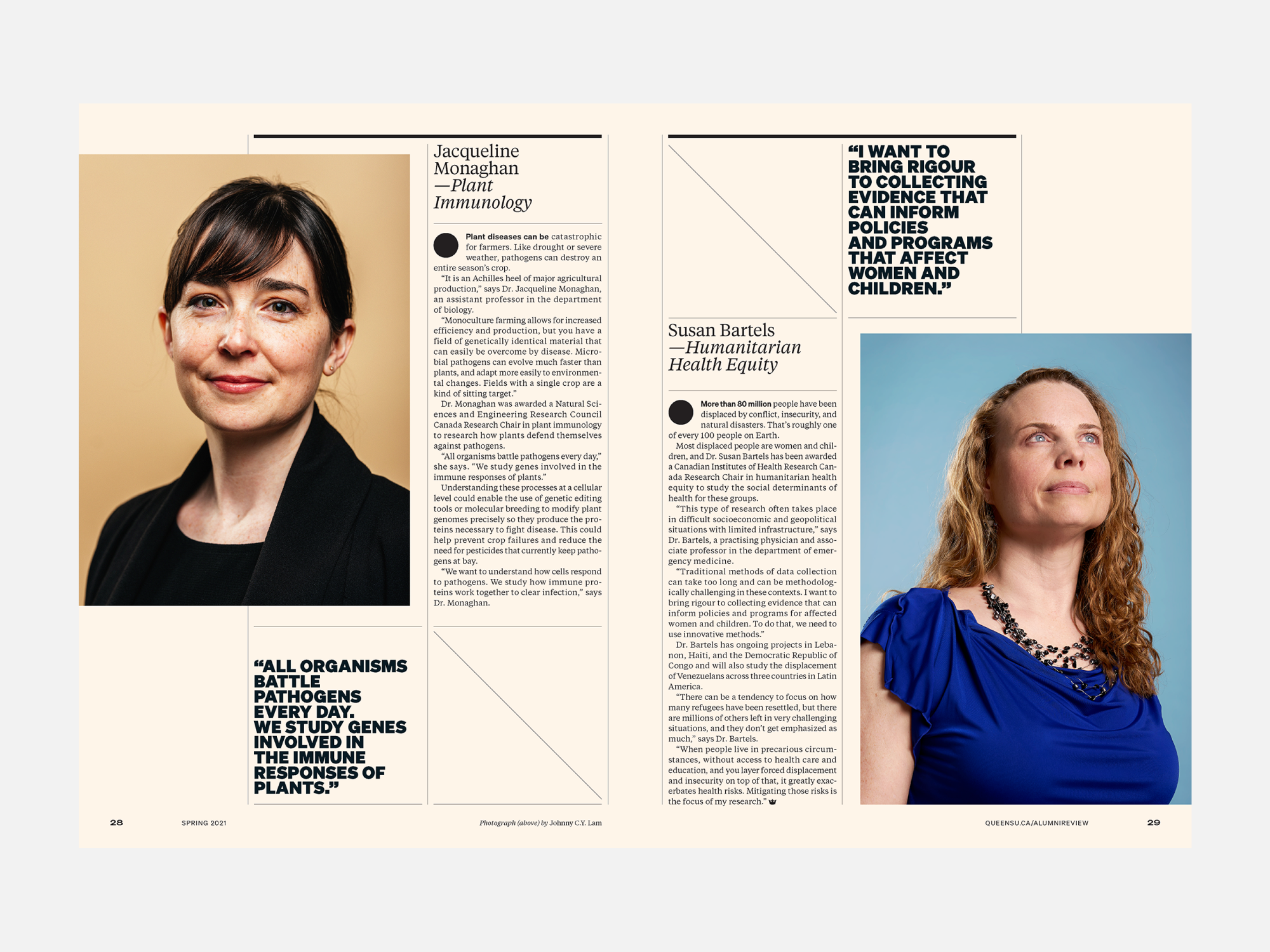
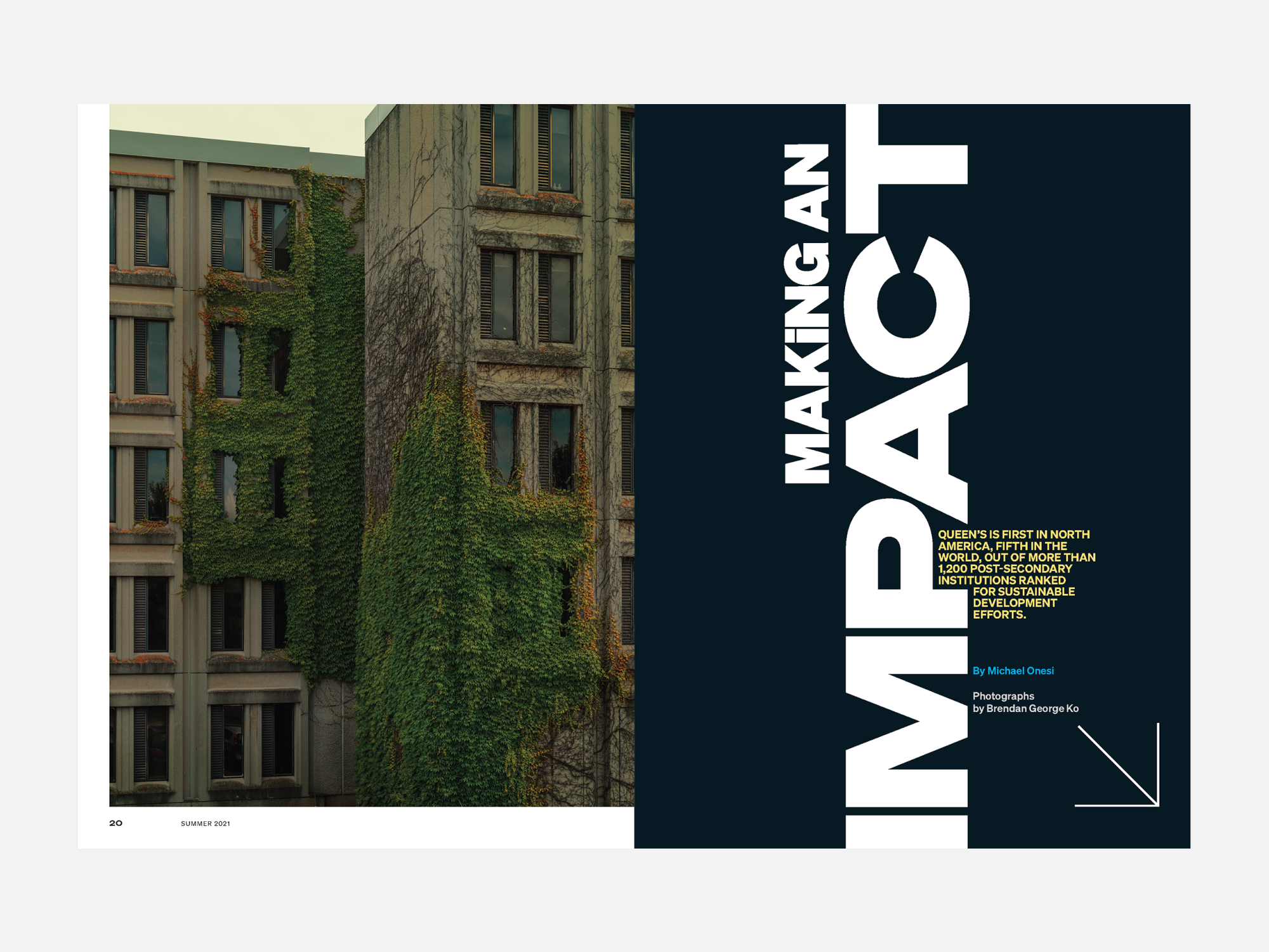
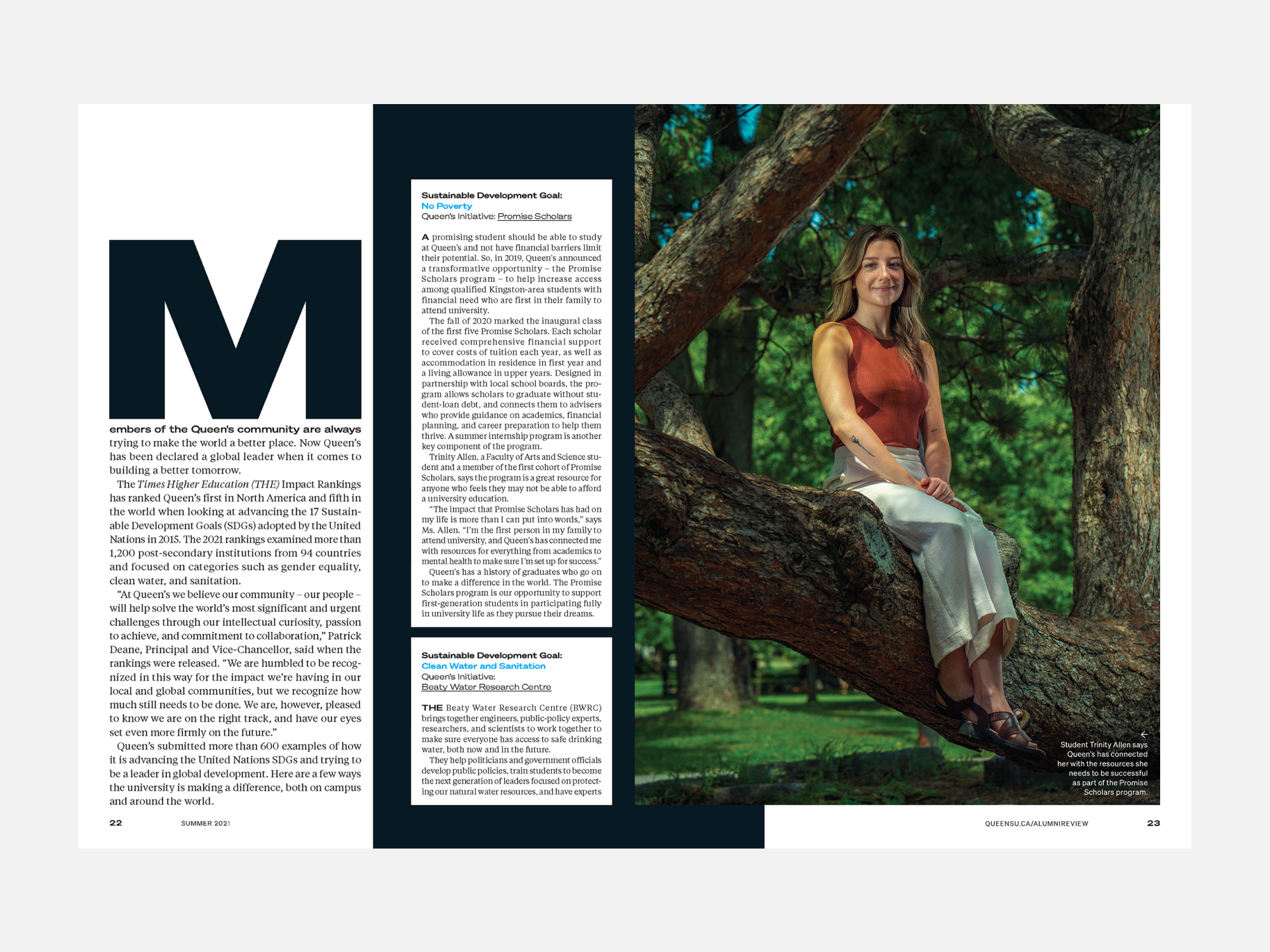
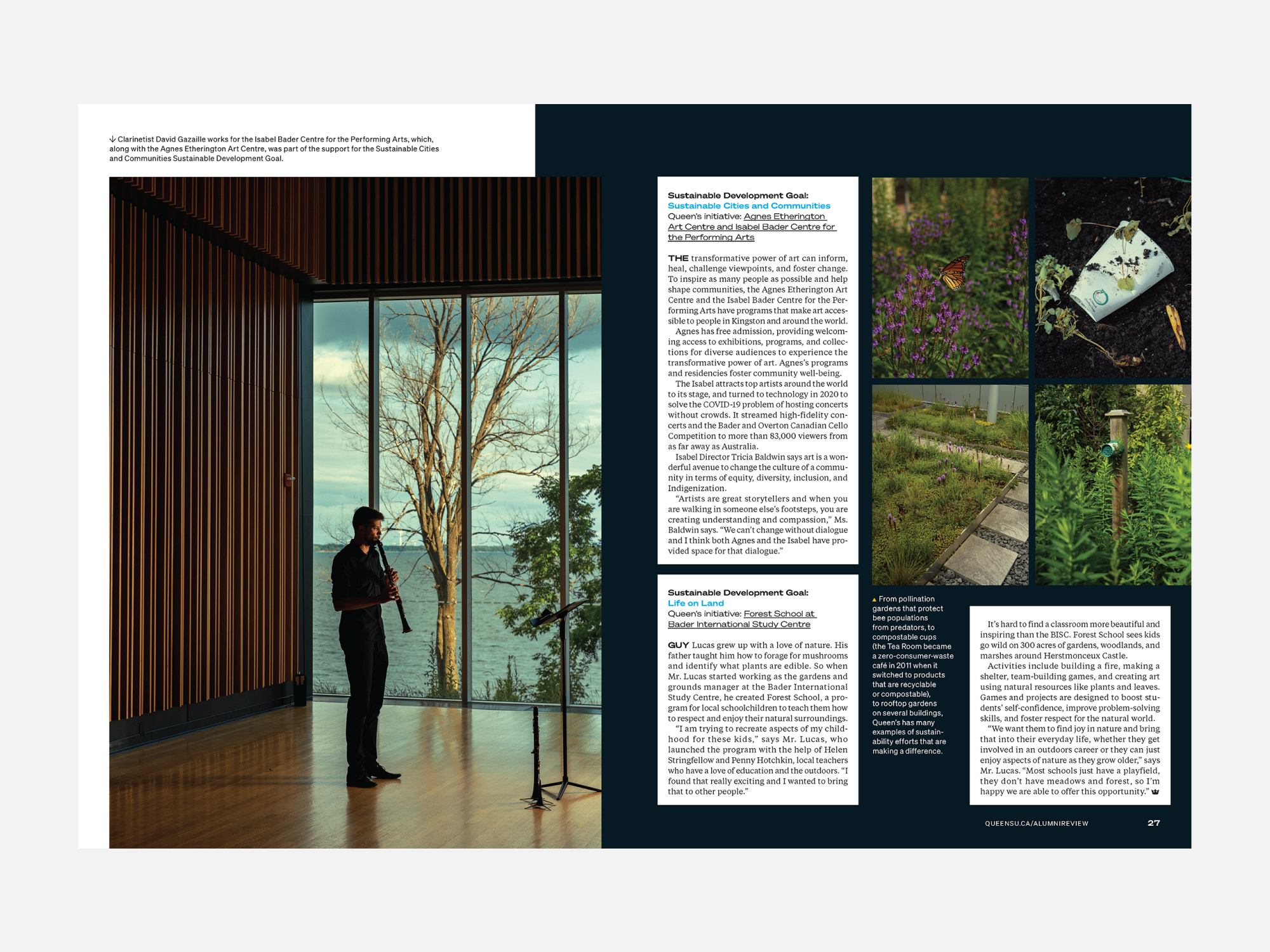
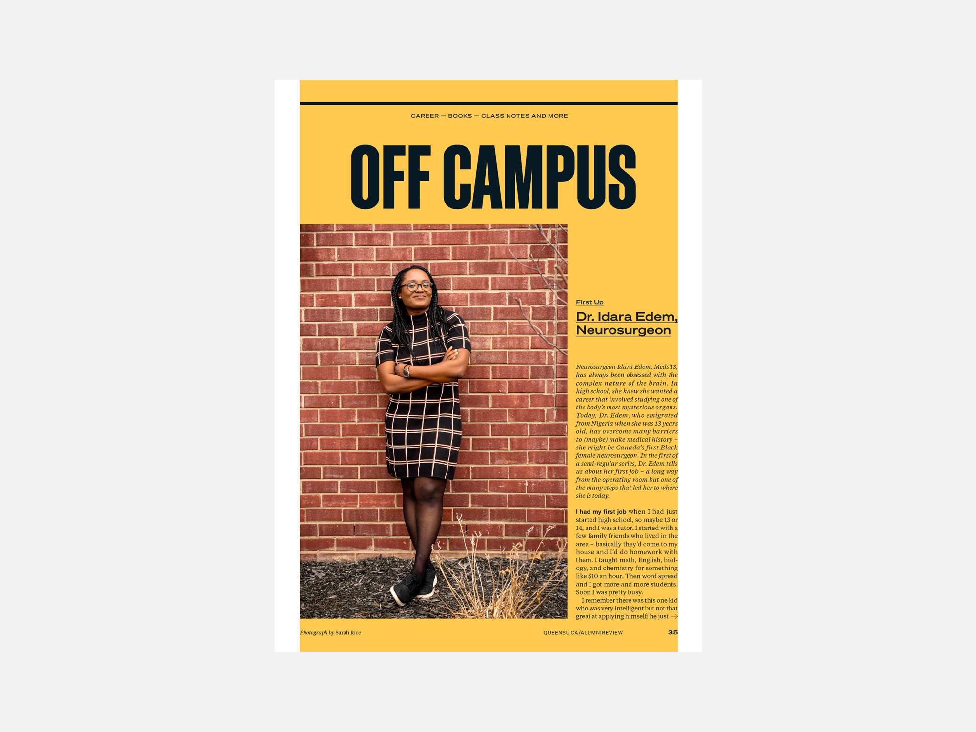
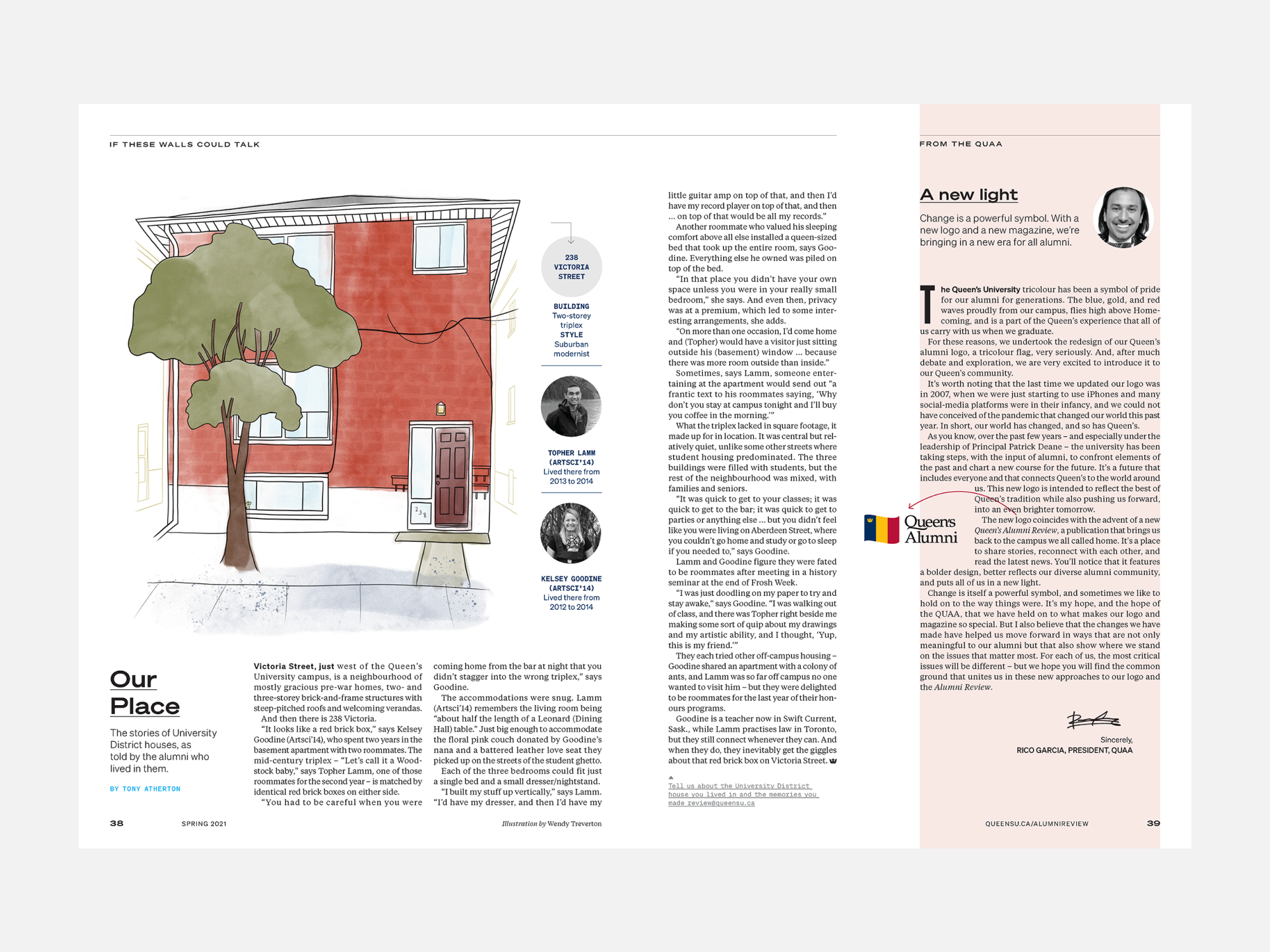
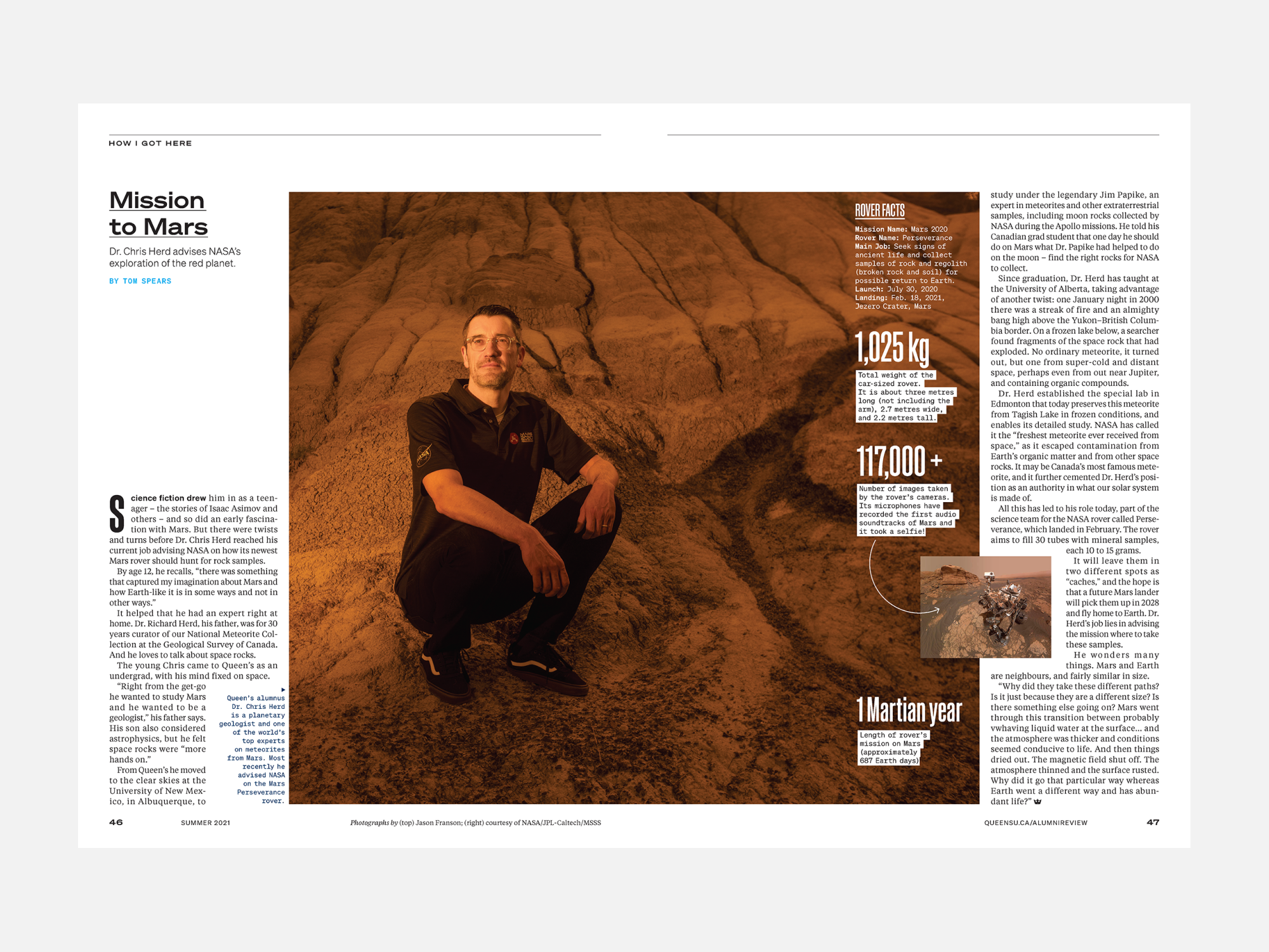
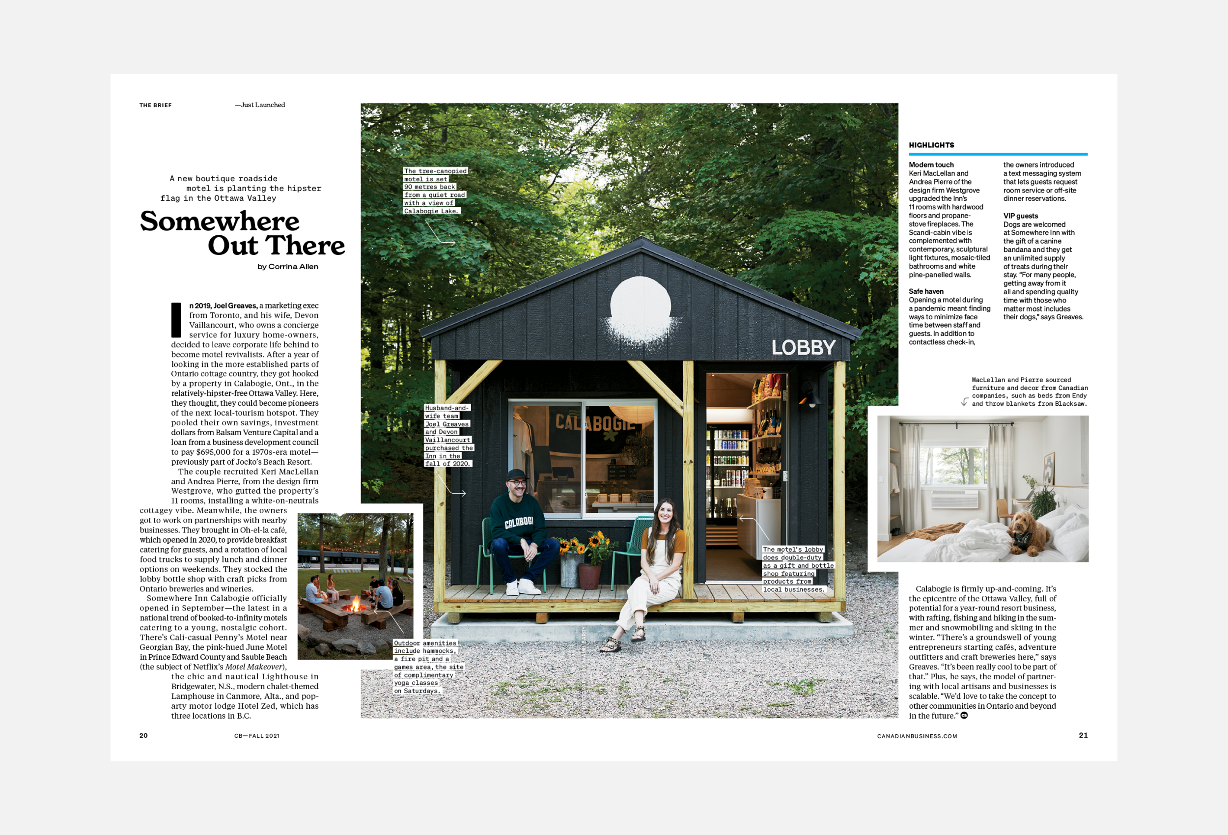
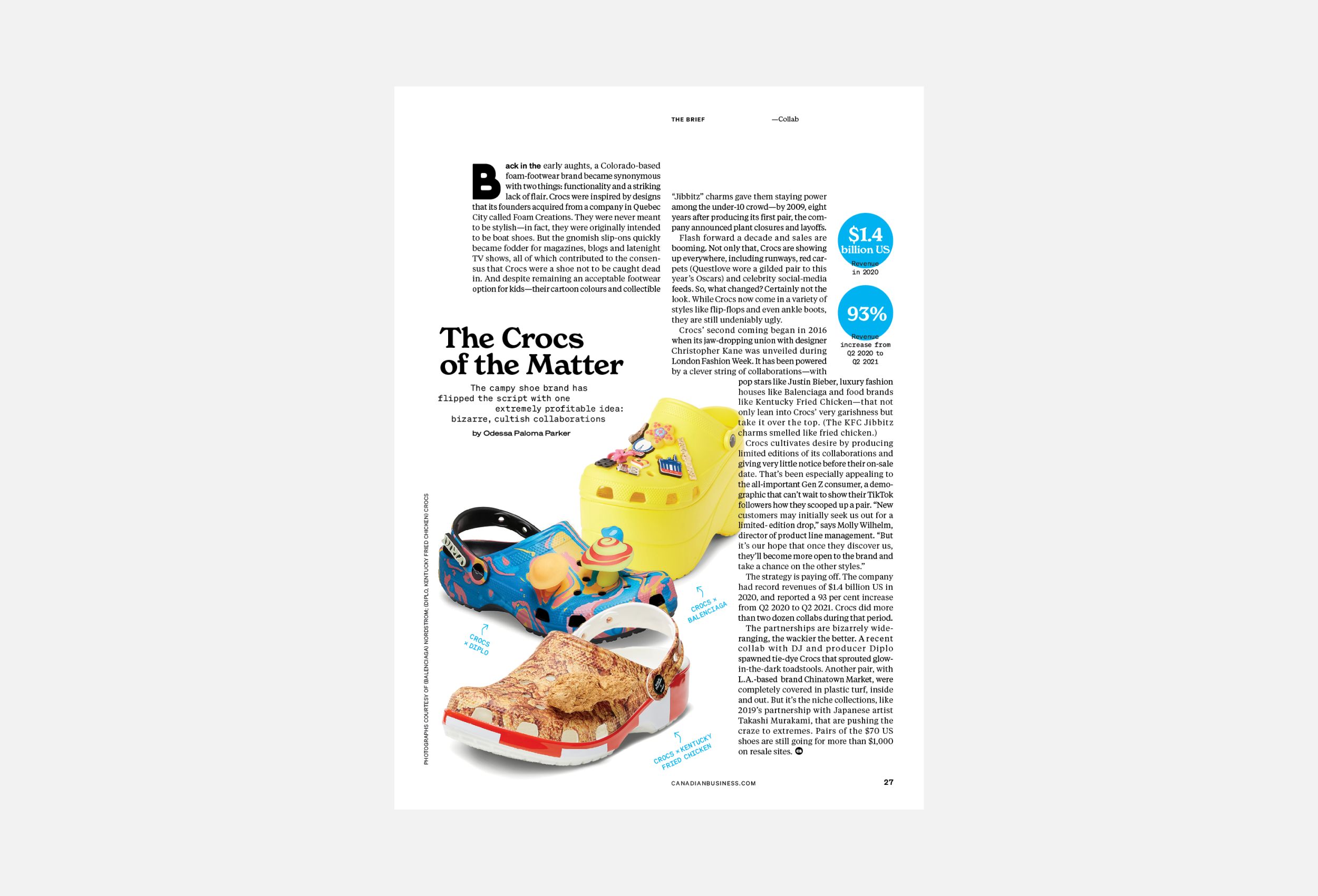
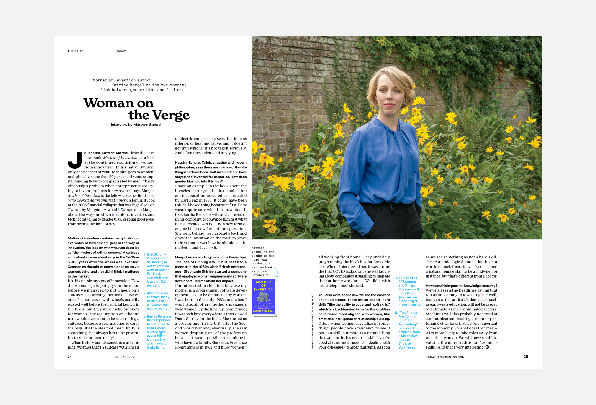
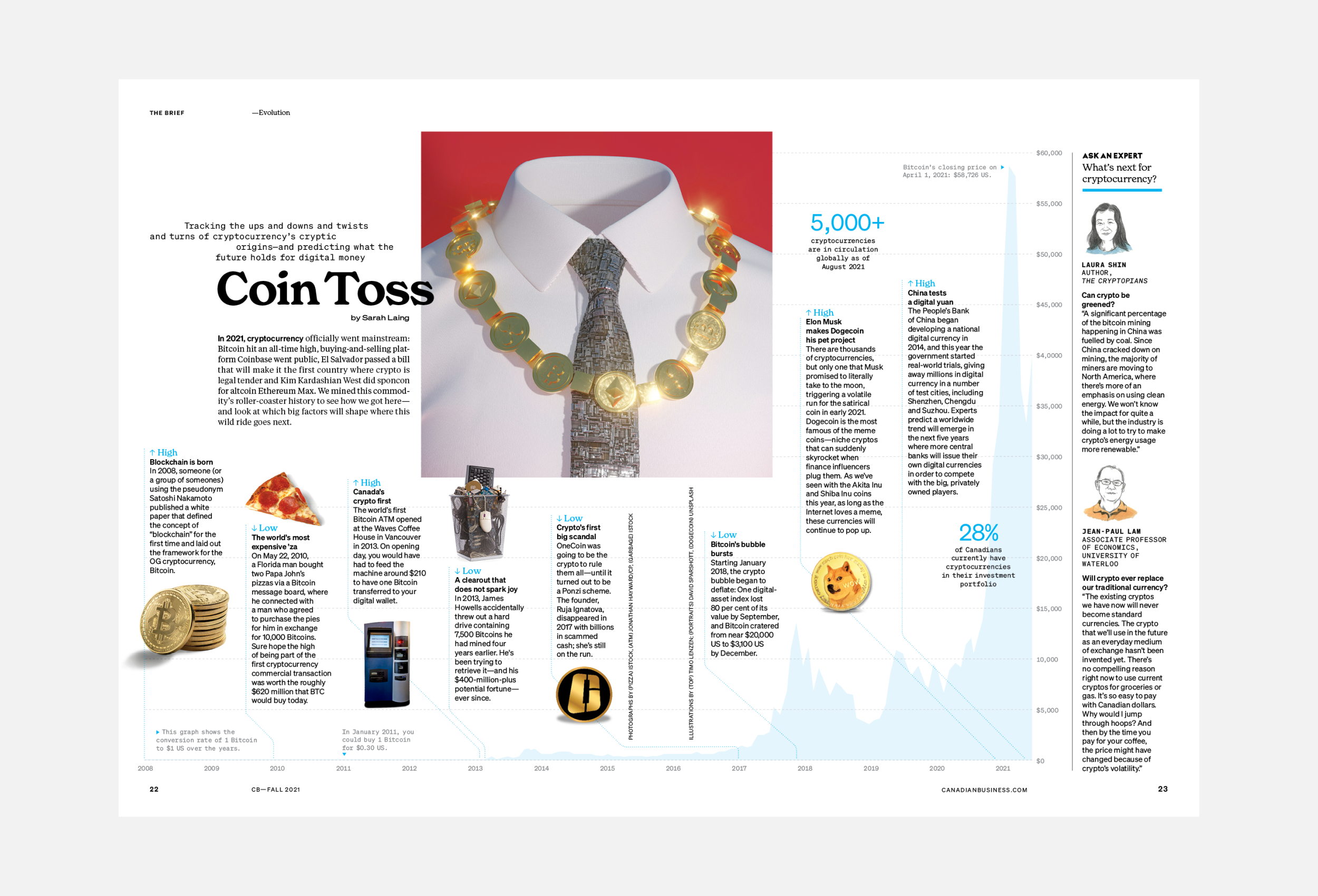
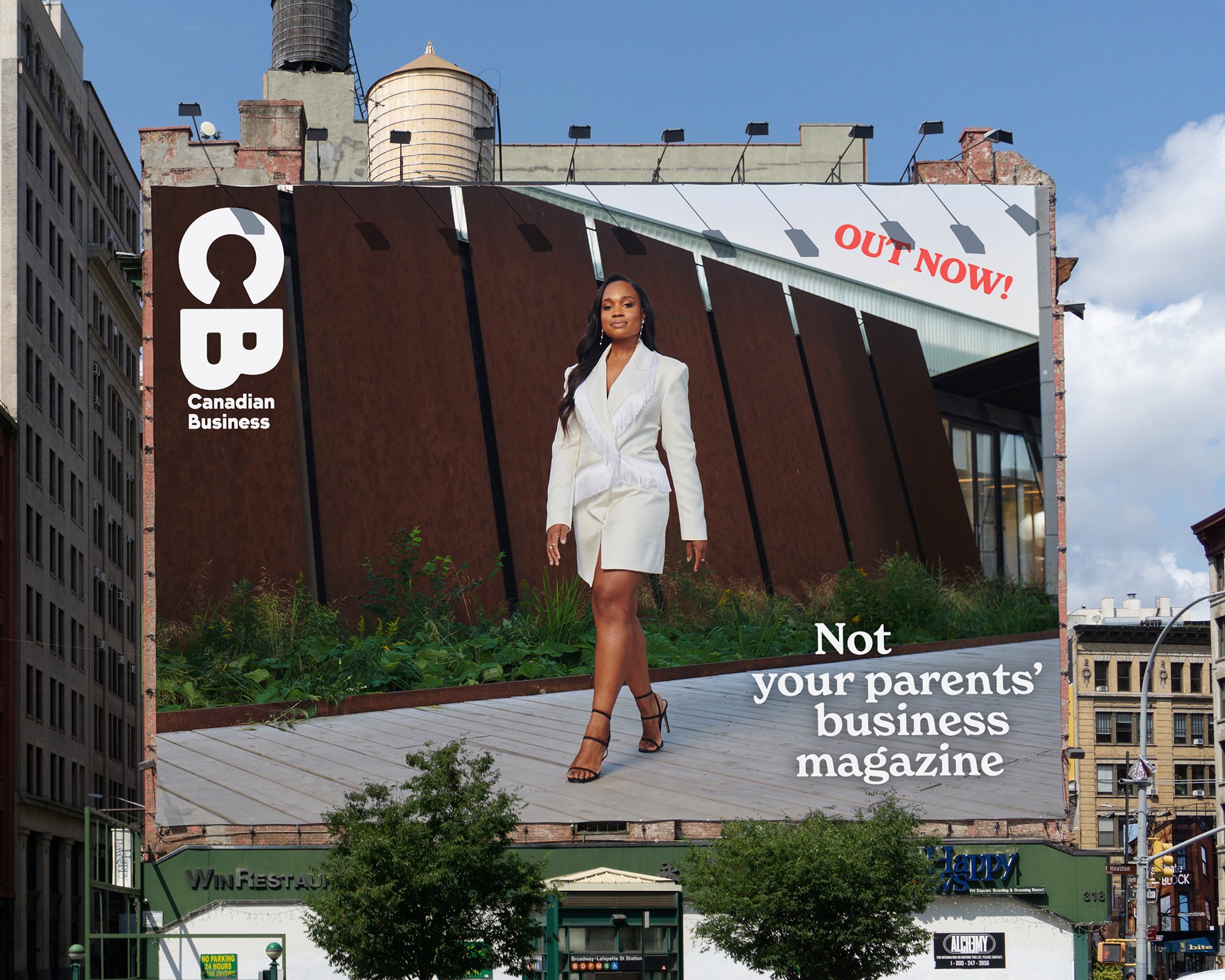
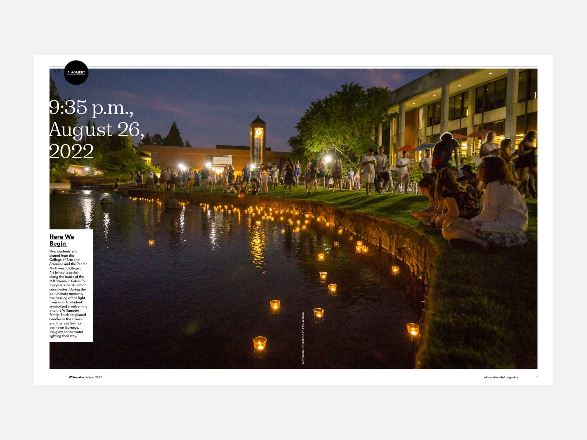
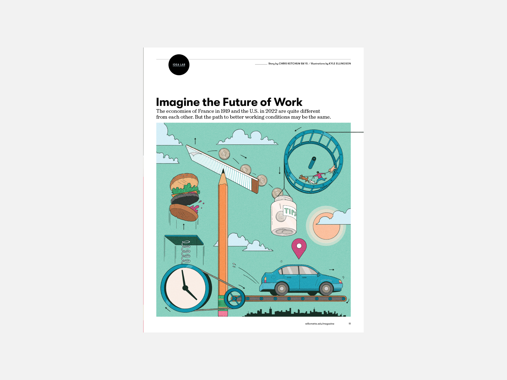
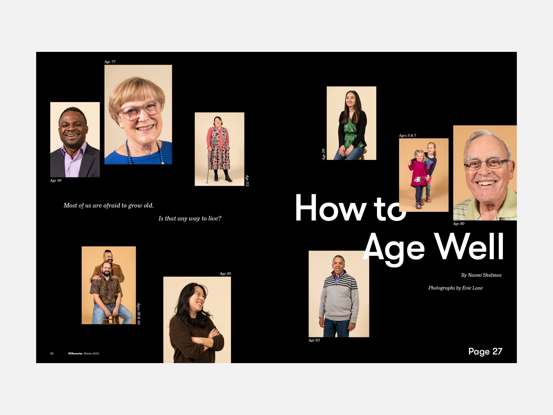
Willamette University wanted a magazine that would bring alumni closer to their alma mater and to each other. They wanted it to be original, smart and witty. "Not your typical alumni magazine."

We created a beautiful, high-quality print and digital publication that hits the mark - generating excitement and pride in the institution. 

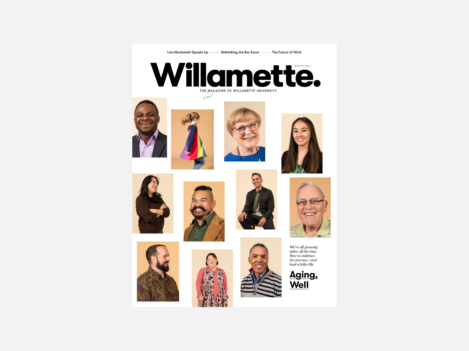
It exudes swagger, right from the logo which ends in a period. Willamette. It’s confident and definitive, like the university itself. 

“If you are seeking partners who are as invested in you, your project, and your team as you are, then look no further than Studio Wyse. From start to finish, the team has guided us, challenged us, and ultimately produced a publication we are incredibly proud of. Their team is composed of professional, high-caliber creatives and industry experts. They started by helping us conceptualize a new alumni magazine, something entirely different: a print periodical as original, modern, and surprising as the University itself. Studio Wyse delivered. Our inboxes have been filled with notes of congratulations, thanks, and true engagement with the content. We are thrilled with the outcome. Studio Wyse receives my highest recommendation and endorsement.”

–Tyler L. Reich, Associate Vice President | Advancement, Executive Director | University Relations

“Hello all — our neighbors in Alaska, natives of Houston, always used to shout ‘Hot Damn!’ when they heard something truly exciting and maybe even slightly alarming or shocking. For native Oregonians, it was always fun but a little disconcerting to hear them carrying on. But when I got my Willamette magazine and gave it a quick read, it was exactly what I said. Content, format, colors and print styles were all… terrific. Thank you all for a fresh, new look at WU! It makes you want to leave it on your coffee table in a sort of proud, modestly boastful way. Well done!”

-Lynne Saxton, past chair of the Board of Trustees

More than just a digital extension of the print publication, the accompanying website provides an interactive, accessible hub where alumni can find bonus content, ongoing updates, and links to the extended Willamette alumni community.

CLIENT: Willamette University
Contributors: kristina barker, Julian croman, Kyle Ellingson, lauren jones, evie lane, ness lee, Gracia Lim, sol neelman, Celeste Noche, chris philpot
Web Development: Sixosix

Queen’s Alumni Review

Established in 1927, the Queen’s Alumni Review (QAR) aims to engage its readership by telling the university’s stories: of bold ideas, innovative teaching, cutting-edge research, alumni achievement and more. Our goal was to build a magazine that better represents the diversity of the Queen’s community and speaks both to where the university has come from and where it’s going.

We brought in more visually-led content and a greater variety in story formats and applied a contemporary look with a bold approach intended to be as innovative as the stories the magazine tells. Using textures within its large photography and small detailed type, the design leans heavily on a black-and-white colour palette and some editorial packaging to allow the content to shine through, engaging readers both emotionally and intellectually.

The magazine won an SPD Merit Award for Redesign of an Entire Issue, B2B Silver for Best Art Direction of a Complete Issue and CASE Silver for Circle of Excellence, Magazines / Publishing Improvement.

“Working with Studio Wyse was an exercise in creativity on all levels — every photo, every story, every font was up for discussion and debate. Those conversations were not always easy, but they resulted in a bold, new direction for the magazine that not only celebrates the best of Queen’s today but that also welcomes the alumni of tomorrow.”

–Editorial team, Queen’s Alumni Review

“The whole thing felt smart, sophisticated, and reflective of a unified vision. A remarkable transformation, from a tired design to a fresh and bold one.”

-CASE judges

CLIENT: QUEEN’S ALUMNI REVIEW
Contributors (SPRING): Sol Cotti, O’shane Howard, Johnny C.Y. Lam, Hamin Lee, Callum Linden (Artsci’20), Finn O’Hara, Sarah Rice, Jennifer Roberts, Rémi Thériault, Wendy Treverton, May Truong, Nick Mrozowski
Contributors (SUMMER): Greg Black, David Chan, Bernard Clark, Jason Franson, Brendan George Ko, Nathalie Lees, Angela Lewis, Lucy Lu, Christopher Katsarov Luna, Miguel Porlan, Brianna Roye, Skye Spence, Wendy Treverton, Heyden Wainwright

Canadian Business Redesign

Founded in 1928, CB is a valued destination for business journalism, profiling and connecting innovators who are changing Canada for the better. We were tasked with rethinking every aspect of the magazine to reflect a more modern approach to business—one that is more diverse, less stuffy and a lot more fun.

The full print and digital redesign includes a fresh new logo, bold typography and engaging photography and illustrations. Colour is used minimally to allow the visuals to stand out. Text columns shift to create dynamic compositions that flow from one page to the next, creating a cohesive yet surprising package.

The website captures the magazine’s exciting new direction in a modern and user-friendly web experience. The homepage features a bold modular grid of interchangeable cards that capture the innovative energy of the mag. The article pages are structured in a flexible way to accommodate both long reads and shorter stories.

“I’m immensely proud of our success in partnering our editors at Canadian Business with the talent at Studio Wyse. The new CB exceeds my expectations in every way. It’s stunning and draws you in immediately. The cover is bold without being overwrought. There’s a great mix of visual storytelling. The illustrations are lively and the photography is beautiful. Together, we’ve produced just about the best magazine that SJC Media has ever published.”

—Ken Hunt, President and Publisher of SJC Media

Congratulations, you made it to the bottom! You deserve a prize so here are some fun outtakes and behind-the-scenes.

CLIENT: St joseph’s communications Editor-in-Chief: Charlotte Herrold
Contributors: Miguel Arenillas, Kyle Ellingson, David Sparshott, May truong, Timo Lenzen, Hanna-Katrina Jędrosz, Kate Ince, Nicole Billark, Yannis Davy Guibinga, Ian Patterson, Jordan Andrew Carter, Jessica Chou, Jennifer Roberts, Steph Martyniuk, Jason Franson, Kathleen Fu, Alia Youssef
Website Development: SIX-O-SIX