Branding

Lafayette Magazine Rebrand

Lafayette College is a small private liberal arts college in the U.S. Founded in 1826, they are proudly independent and academically competitive, offering bachelor degrees in dozens of arts and sciences fields including five in engineering. 

When they approached us, both internal sentiment and feedback from the college community was that Lafayette is among their peers in every measurement that matters—they just weren’t showing it effectively. We set-out to completely re-envision their flagship communication vehicle—the quarterly alumni magazine, its digital counterpart and the supporting newsletter and social media channels. 

The goal was to position the college as an innovative, nationwide leader by showing the impact of its alumni, faculty, and students. We worked with the team to establish a strong editorial mandate and strategy, with more visual content and variety in story formats and a sprinkling of small details, entry points and elements of surprise throughout. 

The new magazine and supporting website are relevant, innovative and confident, telling authentic and meaningful stories while bringing in an energetic and dynamic visual approach. It evokes pride in Lafayette and offers alumni a backstage pass not found elsewhere, all aligned with digital assets that amplify and extend the depth and creativity of the printed stories.

Patron

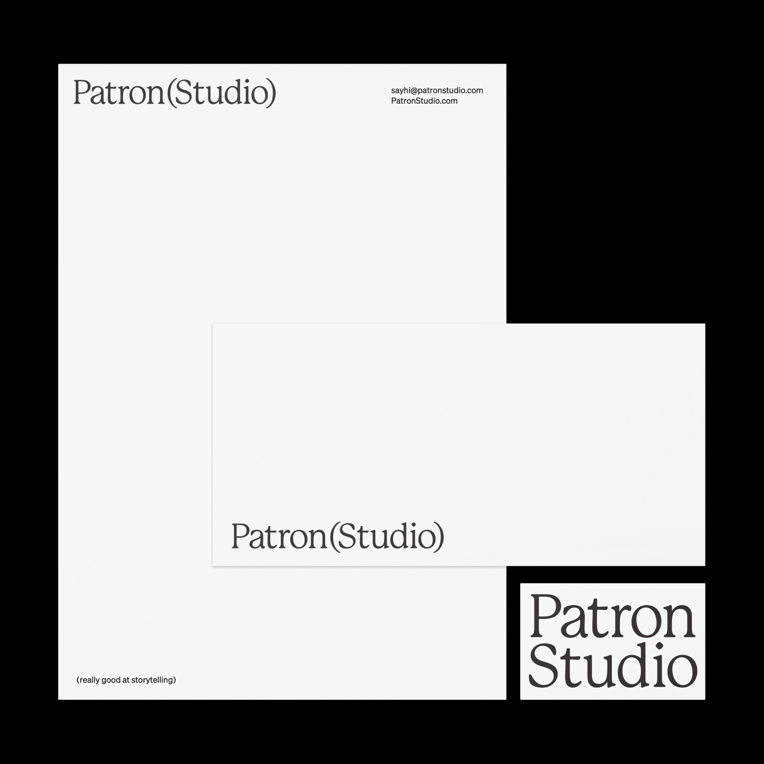
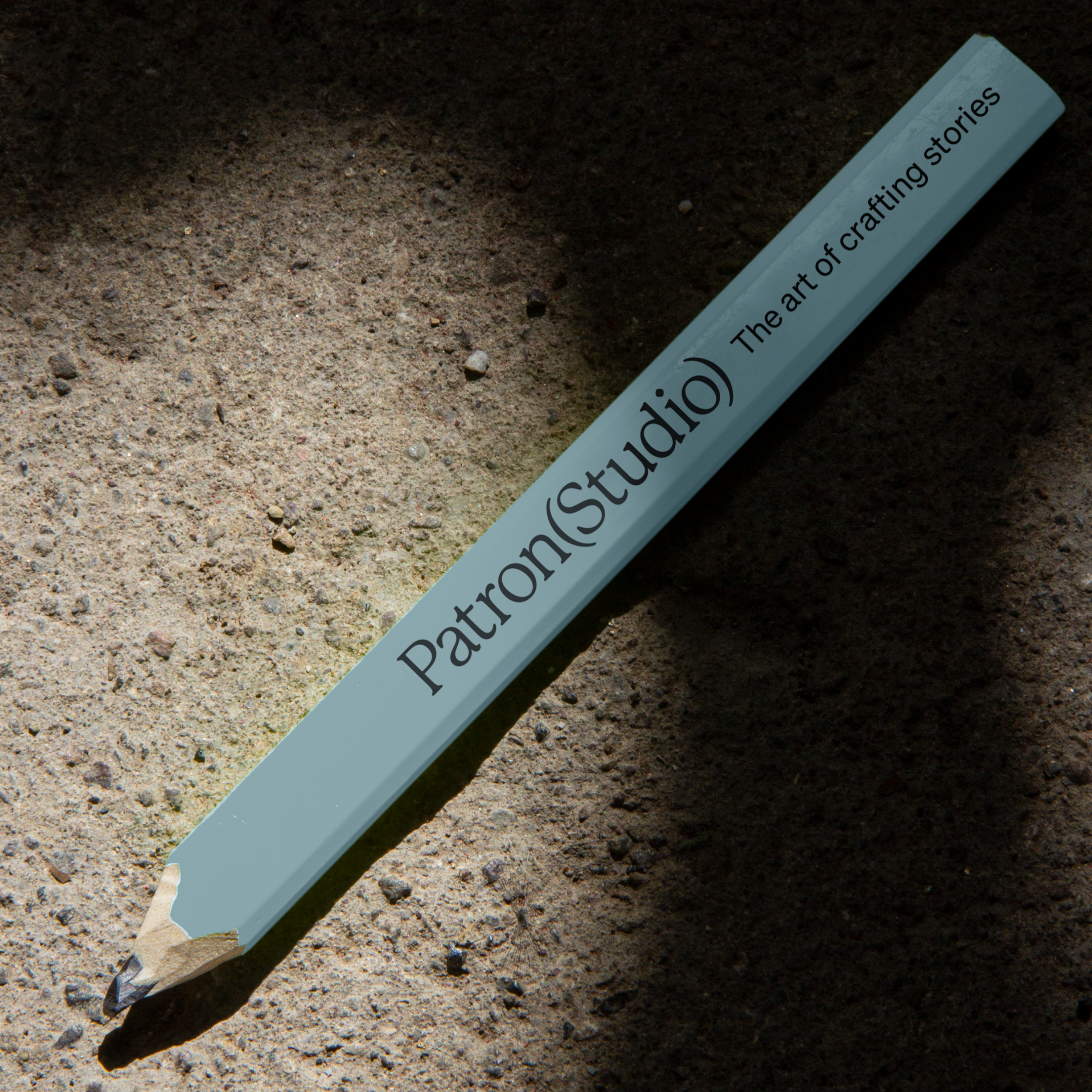
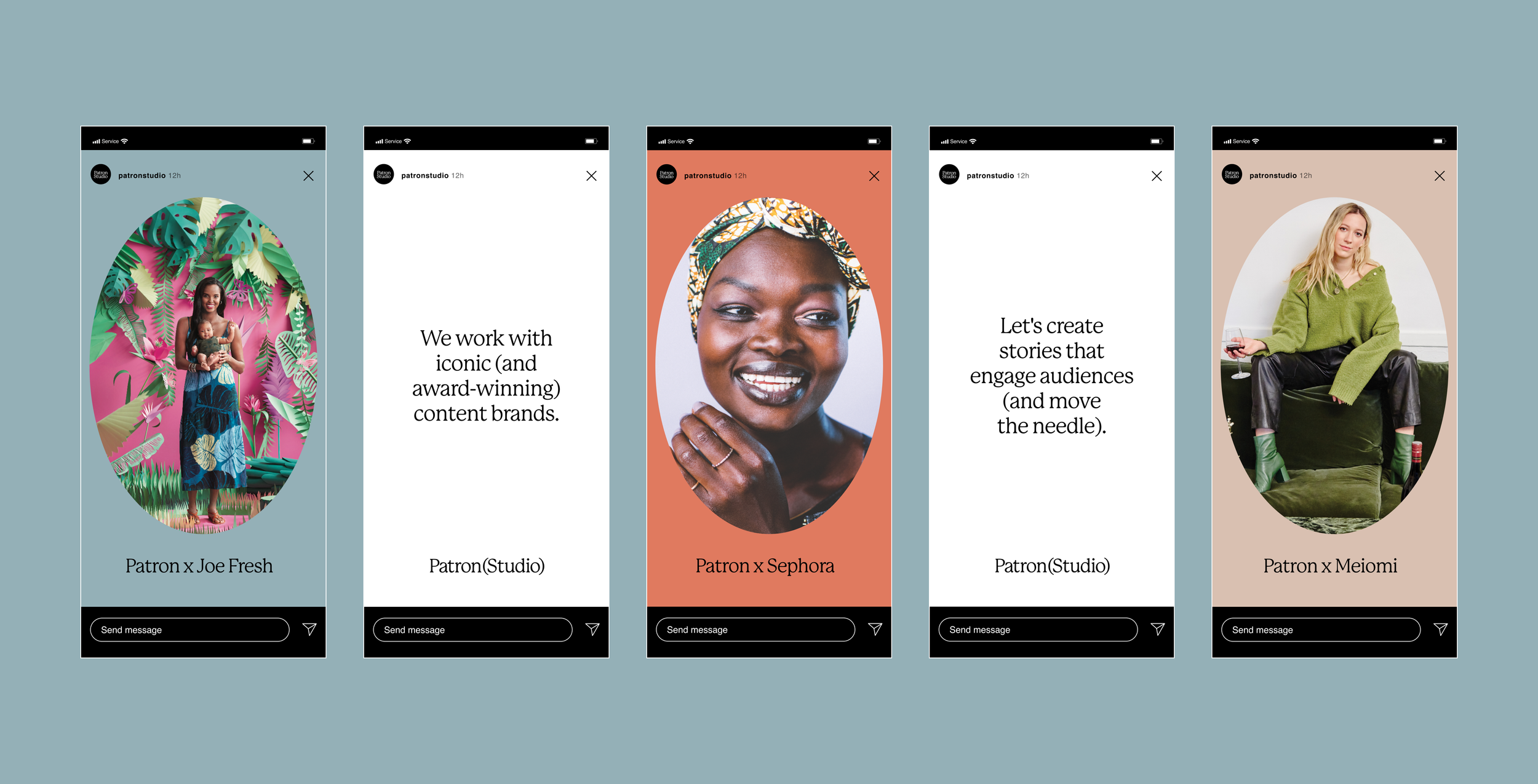
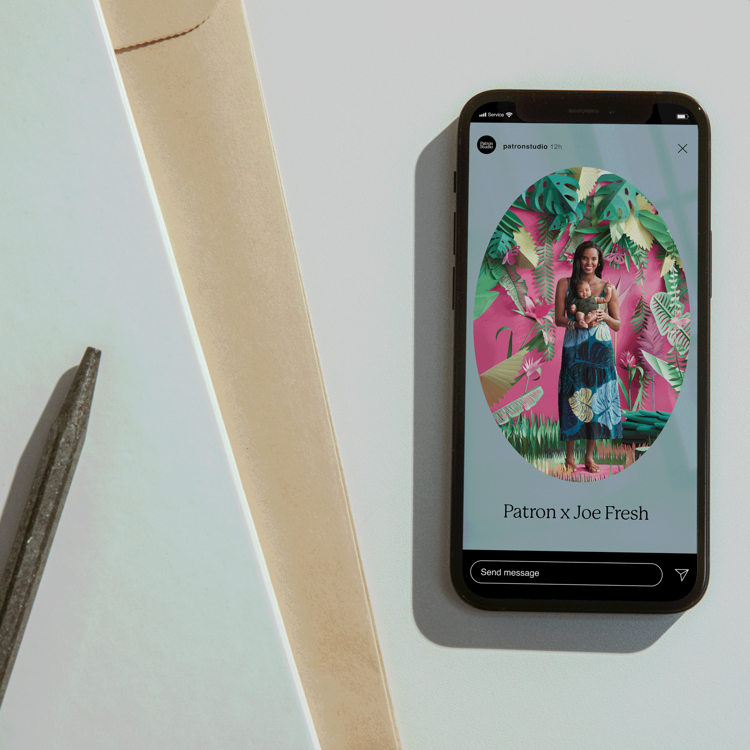
Patron(Studio) is a content studio in the heart of SJC. We worked with the team to develop a brand identity that leans directly into their editorial roots. A serif-forward approach that is not too trendy but has staying power. Its soft and round edges are a nod to the mostly female leadership of the studio and the lifestyle brands whose stories it tells. Feminine, strong and confident. Brackets were used as a device to represent the duality of collaboration and unlocking smart solutions together - the space that Patron creates for the brands to shine. It says craftsmanship and trust while still getting out of the way.

Heartly

Heartly is a new business started by a mother-daughter duo who are passionate about discovering Canadian artisans. The store offers a curated collection of quality, slow-made, handmade objects. We created a brand identity for them that’s modern, sophisticated and authentic, using a conversational tone to deliver fun messages. The logo, colour palette, typography and photo style are approachable and authentic with a touch of attitude.

Butterfly and Courage

Our friends at DarwinCX approached us to develop the visual identity for its two new brands: Butterfly - a paywall that helps capture deeper customer info and generate recurring revenue - and Courage, which educates its audience of primarily consumer marketers about tactics, best practices and insider insight.

We set out to create a bold and confident identity for them—each needing to live on its own while fitting in with the Darwin family. We designed logos that—like Darwin—are smart, modern and a little playful. And because Darwin’s brand icon is a turtle, we created animal icons for the newly launched products as well. Enter the butterfly and lion, who join an extended branded family of Darwin’s animals.

Communal Lunch Project

WorkGallery_Assets_CLP.jpg

The Communal Lunch Project is a Canada-wide resource that addresses food insecurity and social isolation by bringing post-secondary students together for a meal. We teamed up with George Brown College, Meal Exchange and Chef Joshna Maharaj to establish CLP’s brand and design their website, which offers recipes, videos, quick tips and virtual lunches.

We used bright illustration and a welcoming colour palette to convey the warmth of good food and the fun of gathering around an inviting lunch table. Check out @communallunch to see what they’ve been up to!

WorkGallery_Assets_CLP-1.gif
WorkGallery_Assets_CLP7.jpg
WorkGallery_Assets_CLP5.jpg

“It was a pleasure working with the SW team! They did much more than build a website – they challenged us to articulate the intentions of a website that had to respond to a sudden pivot from an in-person research project to a virtual project. The website they created is now the lifeblood of our project. They made this pivot possible because they ask great questions and listen, they are creative and patient, and they are fun – they made our very steep learning curve enjoyable! We highly recommend them.”

Jennifer Mitsche, Project Director, Communal Lunch Project, Professor, Department of English & Communications, George Brown College, NSERC-funded Researcher

WorkGallery_Animation-CLPTeam.gif
WorkGallery_Assets_CLP4.jpg
WorkGallery_Assets_CLP_.jpg

Xtra Magazine

Xtra_Newsletter_Animation3.gif

Xtra is an online magazine and community platform covering LGBTQ2S culture, politics and health that launched in 1984 as a local, free lesbian and gay newspaper in Toronto. Inspired by its activist past and back issues of its printed history, we developed a look that was loud & proud and reflective of the communities it represents.

The website and brand redesign is fresh and modern with lots of playful elements. At the core of Xtra’s new look is the asterisk — a symbol normally used to indicate an omission or a footnote. By reclaiming the power of the asterisk, Xtra says, “We will not be left out or pushed to the bottom of the page — our stories matter.”

As part of the editorial strategy moving forward, we developed an extensive visual playbook that provides an overview of how to use the new look. The book illustrates different story types with direction for artwork that pairs with content to strike the right tone, from loud and playful at times to serious and reserved.

Xtra238.png

Studio Wyse took us down dozens of wonderful rabbit holes in their research—including a fascinating discussion about whether fonts have genders—and dug deeply into our activist, DIY past for design inspiration. They made mood boards of the covers of back issues of The Body Politic and Xtra, pictures of our old hot pink newspaper boxes, 1980s AIDS activism posters and 1990s queer zines. They introduced us to the work of some fabulous LGBTQ2S+ photographers and illustrators, with an emphasis on the work of racialized artists, to support our vision of showcasing more images of members of our communities throughout our site. The resulting look is modern, elegant and easy to navigate, but with lots of playful elements and surprises.

rachel giese, editorial director, xtra magazine

WorkGallery_Assets_Xtra.jpg
WorkGallery_Assets_Xtra14.jpg
WorkGallery_Assets_Xtra10.jpg
Xtra13.png
Glitter3.gif
WorkGallery_Assets_Xtra5.jpg
WorkGallery_Assets_Xtra11.jpg
WorkGallery_Assets_Xtra15.jpg

Motion graphic animation by Julian Brown, On the Chase